
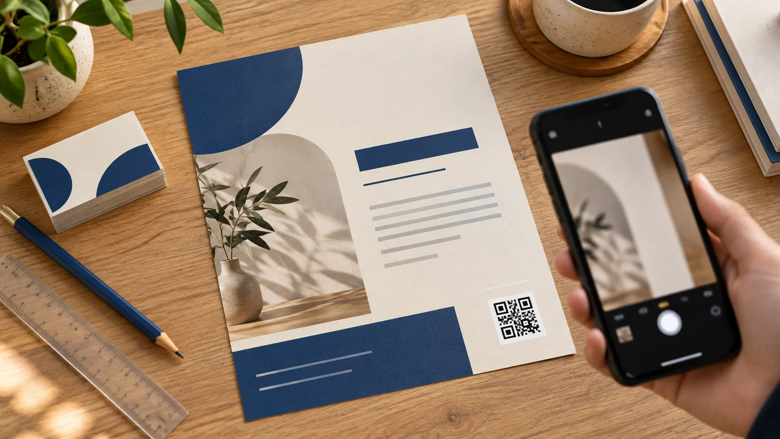
A good printed QR code needs six things: enough size, strong contrast, clear space around it, a sensible position, a useful destination, and testing on the finished piece. Treat it as a functional part of the layout rather than decorative confetti. Give it a defined job, place it near a short action message, and let the rest of the design provide the personality.
The easiest visual formula is a dark code on a plain light background, positioned in a calm part of the layout. Start around 1 inch square for material scanned at close range, then enlarge it when people will scan from farther away. That is a starting point rather than a universal minimum: code density, printing method, surface, finish, lighting, and scan distance all affect the result.
Give the QR code one clear job
Decide what happens after the scan before adjusting colors or corners. A QR code works best when it removes a step: open the ordering page, register for the event, view the menu, get directions, watch a demonstration, complete a form, or save contact details. Sending everyone to a generic homepage often makes the scan feel like extra work.
Place a plain-language instruction beside the code. “Scan to order lunch,” “Scan for Saturday’s schedule,” and “Scan to book an appointment” are more persuasive than “Scan me.” The message sets an expectation and helps the reader decide whether reaching for a phone is worthwhile.
Use a concise destination URL where practical. Encoding more data can produce a denser symbol with more modules, which can demand a larger printed area for dependable reproduction. The DENSO WAVE code-area guidance explains how code dimensions depend on the number and size of modules, including the surrounding quiet zone.
Choose a size for the real viewing distance
For a flyer, menu, postcard, tabletop card, or package insert held in the hand, roughly 0.8 to 1 inch square is a useful planning range found in institutional print guidance. Make the code larger when the layout allows. Posters, windows, counter signs, and yard signs require more generous sizing because people may scan them from several feet away. One published rule of thumb uses a 10:1 ratio between scanning distance and code size.
| Printed use | Practical starting approach | Design priority |
|---|---|---|
| Business card | Use about 1 inch if the layout can support it | Keep it away from contact details and trim |
| Flyer or menu | Start near 1 inch and test at normal holding distance | Pair it with one short action message |
| Table sign | Increase the size for seated or standing visitors | Prevent glare from overhead lighting |
| Poster or window sign | Size for the expected scanning distance | Keep the code accessible, level, and unobstructed |
| Sticker or label | Use the largest code the usable flat area allows | Test the actual material, shape, and finish |
A mathematically adequate code can still be inconvenient in practice. DENSO WAVE recommends making modules as large as the available area permits because larger modules are more stable and easier to scan. Print capability and the intended scanning device also matter.
Protect the quiet zone
The blank border surrounding the code is called the quiet zone. It helps a scanner separate the symbol from nearby text, photographs, patterns, and borders. Standard guidance calls for a quiet zone at least four modules wide on every side. Do not count a busy photograph or a pale section of an illustration as blank space. Use a solid, uninterrupted background.
This is where otherwise attractive designs often go wrong. A designer places a thin frame tightly around the code, lets a headline touch one edge, or overlaps it with a decorative leaf. The result may look integrated, but it weakens the visual boundary the scanner needs. Build the quiet zone into the QR asset or reserve it explicitly in the layout.
Use contrast instead of decoration
Black on white remains the safest combination, but it is not the only workable one. A very dark brand color can sit on a white or very light solid field. The important distinction is between dark data modules and a light background.
The GS1 guidance for two-dimensional barcodes cautions against low contrast, gradients, and color combinations that make light and dark modules difficult to distinguish. Red, orange, and yellow are poor choices for the dark modules when reliable scanning matters. Square modules, intact corner finder patterns, and an even grid provide a dependable foundation.
Logos and unusual module shapes introduce risk. A small central logo may work when the code has suitable error correction, but it uses some of the code’s recovery capacity. Large logos, altered corner markers, and heavily stylized cells can cause failures. If branding is important, put the logo and brand message beside the code rather than making the code carry the entire visual identity.
Place it where a person can actually scan it
Keep the code away from trim lines, folds, seams, package corners, curved areas, and places likely to be covered by a hand, fixture, mailing label, or display holder. On flat print, protect it with the same discipline used for other essential content. The guide to bleed and safe areas for small-business print explains how trim and safety margins affect important elements.
Avoid hiding the code in a crowded legal footer. Put it close to the related offer and action message, with enough open space to feel deliberate. On a flyer advertising three services, for example, one well-labeled code leading to a booking page will usually produce a cleaner design than three unexplained codes competing for attention.
Material and finish also matter. Reflective coatings can create glare, while transparent materials can allow packaging graphics or product colors to show through. Curves, scratches, ink spread, smearing, and surface texture can distort the grid. Test transparent, glossy, or irregular applications on the actual finished item rather than approving them solely from a screen preview.
For a sticker or label campaign, select the finished size, surface, and application method first. You can then view options at CustomStickers for custom stickers, labels, materials, and artwork preparation.
Follow a print-proofing sequence
Proof the complete design at its actual printed dimensions. Canva’s print guidance supports checking designs at final size and exporting through its PDF Print workflow, with bleed, crop marks, and color-profile options available as the job requires. Keep essential content inside the safety margin and follow the printer’s own file specifications for bleed and crop marks. Canva’s margins and bleed guidance provides a useful setup reference.
- Generate the final QR code using the destination that will be published.
- Place it at the intended physical size with its quiet zone intact.
- Export the production file using the printer’s required format, bleed, and color settings.
- Print a full-size paper proof and scan it with more than one phone if available.
- Order or produce a physical sample when the final stock, coating, transparency, curve, or mounting method could affect scanning.
- Test the finished piece from the expected distance and angle under realistic lighting.
- Open the destination and complete the intended action, such as submitting the form, viewing the menu, or placing a test order.
A successful phone scan is a practical go-or-no-go check, but it is not formal barcode verification. It also proves only that the phone could decode the symbol; it does not confirm that the landing page is fast, current, readable on mobile, or useful. Test both halves of the experience.
A simple worked example
Imagine a neighborhood restaurant promoting online lunch orders with a counter flyer. Start with one destination: the mobile ordering page. Add the line “Scan to order lunch,” then place a dark QR code on a white field near that message. Begin at about 1 inch square, preserve the full quiet zone, and keep the unit inside the flyer’s safe area.
Print the design at full size and test it from the distance customers will naturally hold or view the flyer. If the counter has strong overhead lighting, check for glare on the selected paper. If scans feel fussy, enlarge the code or choose a less reflective finish before experimenting with decorative styling. The guide to choosing flyer paper can help when deciding between gloss, matte, uncoated, and heavier stocks.
Make the functional choice first
The best-looking QR code is the one readers barely have to think about. Give it a specific destination, make it comfortably large, preserve the quiet zone, use decisive contrast, and place it where scanning feels natural. Then test the exported file and the finished print under real conditions. Once those essentials work, the surrounding typography, color, photography, and brand voice can make the piece memorable without asking the code to become a tiny work of art.
Frequently Asked Questions
How large should a QR code be on printed marketing?
For close-range pieces such as flyers, menus, and postcards, roughly 0.8 to 1 inch square is a useful starting range. Enlarge it for signs viewed from farther away; a 10:1 scanning-distance-to-code-size ratio is one practical rule of thumb.
How much blank space does a printed QR code need?
Keep a quiet zone at least four modules wide on every side. Make it a solid, uninterrupted background rather than part of a photograph, pattern, border, or illustration.
Can a QR code use brand colors?
Yes, but keep the code very dark and the background light and solid. Avoid weak contrast, gradients, and red, orange, or yellow data modules when dependable scanning matters.
Where should a QR code go in a print layout?
Place it near the relevant offer and a clear instruction such as “Scan to book.” Keep it away from trim lines, folds, seams, curves, crowded footers, and anything likely to cover it.
Can I put a logo inside a QR code?
A small central logo may work with suitable error correction, but it uses some of the code’s recovery capacity. For the safer design choice, keep the finder patterns intact and place prominent branding beside the code.
How should I test a QR code before printing the full order?
Print a full-size proof, scan it with more than one phone if available, and test the finished material under realistic lighting, distance, and angles. Then open the destination and complete the intended action; a successful scan alone does not confirm that the mobile experience works well.
References
- Point for determining the code area | QRcode.com | DENSO WAVE
- Information capacity and versions of QR Code | QRcode.com | DENSO WAVE
- # BEST PRACTICES WHEN USING QR CODES
- Brand and Graphic Standards
- Point for setting the module size | QRcode.com | DENSO WAVE
- 2D Barcodes at Retail Point-of-Sale Implementation Guideline
- Guide
- Implementation Guideline
- 2D Barcodes at Retail Point-of-Sale Implementation Guideline
- What should I check to ensure good quality barcodes? : GS1 GO Customer Service Portal
- 1D Barcode Verification Process
- Use margins, bleed, rulers, and crop marks – Canva Help Center
- Proof your designs for print – Canva Help Centre
- Guideline