Author: Joyce Tofte

  • Punch Cards vs Digital Loyalty Programs for Local Businesses

    Punch Cards vs Digital Loyalty Programs for Local Businesses

    TLDR

    The practical answer to punch cards vs digital loyalty is simple: start with a physical punch card when the offer is based on straightforward repeat visits and your team needs an easy counter routine. Choose digital loyalty when account records, configurable earning rules, multiple locations, or targeted promotions solve a real operational need. A hybrid can work, but only if the printed and digital parts support one clearly explained program rather than creating two competing systems.

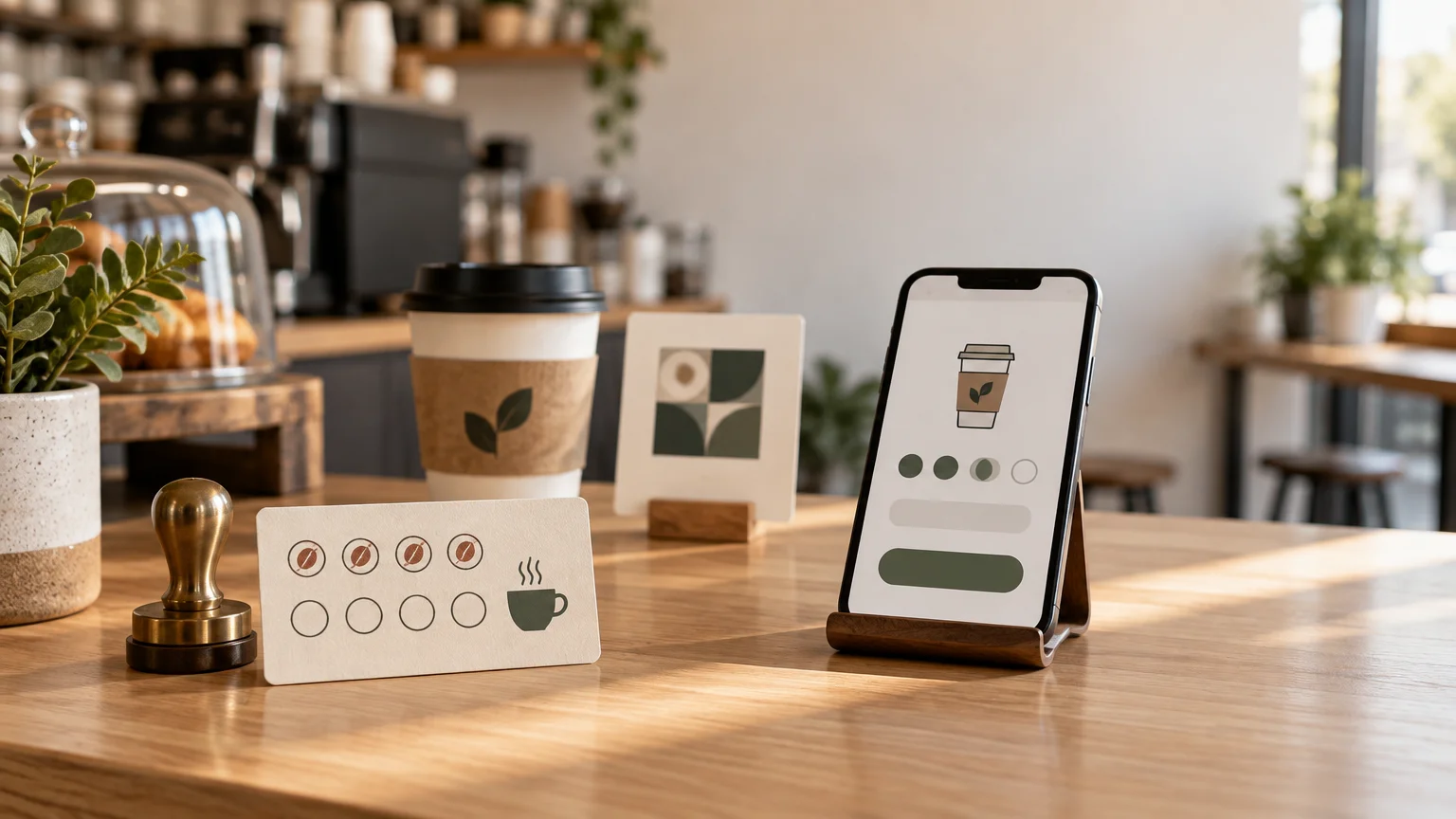
    The best loyalty program is not the one with the most features. It is the one customers understand and employees remember to use during a busy transaction. For many cafés, food counters, salons, independent retailers, and event vendors, that makes a well-designed card a strong first move. Digital becomes more valuable when the business is genuinely prepared to manage enrollment, customer information, reward rules, and staff training.

    Punch cards vs digital loyalty at a glance

    Decision point Physical punch card Digital loyalty program Simple hybrid
    Best fit One-location businesses with a simple visit-based offer Businesses needing account records, flexible rules, or coordinated locations Businesses that want printed promotion with digital enrollment
    Customer action Carry a card and present it during a visit Enroll and identify an account at checkout Scan or follow a printed prompt, then enroll digitally
    Staff action Apply a consistent punch, stamp, or mark Find or associate the account and process earning or redemption Explain enrollment and operate the digital system
    Customer data Usually none unless collected separately May require an identifier and account information Depends on the digital platform
    Rule flexibility Best kept simple and visible Can support more detailed earning and reward structures Digital rules with a physical sign-up touchpoint
    Common failure point Lost cards, unclear marks, or inconsistent punching Slow enrollment, unclear privacy expectations, or staff skipping the process Customers cannot tell whether physical and digital rewards stack
    Useful print companion Wallet card, receipt insert, or small counter sign Counter sign, bag insert, menu prompt, or window decal A prominent sign, insert, or sticker with one call to action

    Neither column is automatically better. The right choice depends on transaction speed, customer habits, staff capacity, and what the business intends to do with the resulting information.

    Choose a punch card when simplicity is the advantage

    A punch card works especially well when customers buy in person and the reward can be explained in one sentence. “Buy nine lunches and your tenth is free” is visible, tangible, and easy to discuss without an account-creation detour. The customer leaves with a reminder carrying the business name, offer, and progress toward the reward.

    Physical cards are also forgiving operationally. Employees need to recognize qualifying purchases, make the approved mark, and explain the reward. There is no digital enrollment flow to troubleshoot. That can matter at a crowded coffee counter, market booth, or reception desk where every additional checkout step is noticeable.

    The tradeoff is limited visibility. Unless the business records activity elsewhere, it will not have account-level histories or an automatic way to contact cardholders. Cards can also be lost, forgotten, or presented with questionable marks. Set a clear replacement policy before that awkward conversation happens.

    Keep the offer narrow. A card that asks employees to distinguish among several purchase categories, bonus days, membership levels, and exclusions is trying to behave like software. If the explanation no longer fits comfortably on the card, either simplify the program or consider a digital system.

    A practical physical-card checklist

    • State the earning action and reward in one sentence.
    • Make the reward visually prominent instead of burying it in small terms.
    • Use clearly separated and, where useful, numbered mark spaces.
    • Include only essential restrictions, such as qualifying purchase rules or an expiration date.
    • Choose one staff mark that is recognizable and difficult to reproduce casually.
    • Explain what happens when a customer loses a card or brings several partly completed cards.
    • Keep important text and mark spaces comfortably away from trim edges.
    • Before ordering, review the artwork using a reliable print-ready file preparation workflow.

    If the card must withstand frequent wallet handling, discuss stock and finish options with the selected printer before building the final file. A writable or stampable area may matter more than a luxurious finish. Do not approve production until the printer confirms that the chosen marking method suits the surface.

    Choose digital when the records justify the setup

    Digital loyalty earns its extra complexity when the business will use capabilities that a paper card cannot provide neatly. Square’s documentation, for example, describes accounts, points accrual, reward redemption, promotions, and loyalty-event records. Its system can support earning rules based on visits, spending, particular items, or categories. These are examples from one platform, not promises about every loyalty provider.

    That flexibility may suit a two-location salon that wants clients to earn across both locations, or a restaurant that wants qualifying categories rather than a single visit count. It can also help when management needs account-level records to resolve reward questions consistently.

    Digital is not automatically frictionless. Some workflows require customers to enroll and associate an identifier with an account; Square documents phone-number mapping as one way an account can be associated. The owner should test the entire experience from the customer’s side: enrollment, earning, checking progress, redemption, and getting help after changing a number or losing access.

    Before selecting a provider, ask whether it fits the existing point-of-sale, appointment, online-ordering, or multi-location workflow. Then confirm who configures rewards, who trains new employees, and who handles account problems. A sophisticated program that staff routinely skip is less useful than a modest program operated consistently.

    Treat customer information as an operating responsibility

    A punch card can often operate without identifying its holder. A digital program may collect contact or account information, which creates additional responsibilities. The Federal Trade Commission’s business security guidance advises collecting only the information a business needs, retaining it only while there is a legitimate business need, and protecting the information it maintains.

    Translate that principle into concrete questions before launch: What information is necessary to run the reward? Who can access it? How long is it retained? What does the provider handle, and what remains the business’s responsibility? Separate permission for promotional messages may also be relevant. Obtain appropriate legal guidance for the jurisdictions and communication channels involved rather than treating general security guidance as a complete compliance checklist.

    A hybrid should connect print and digital, not duplicate them

    A useful hybrid is usually a digital program with a printed invitation. A counter sign, takeaway insert, window decal, menu prompt, or sticker tells the customer why to join and provides the next step. The print piece remains visible in the physical environment while the digital system handles enrollment and rewards.

    For example, a restaurant could place custom stickers for a QR-code sign-up prompt on a counter display or sealed takeout packaging. The sticker is only a touchpoint; the destination still needs to be mobile-friendly, current, and clearly connected to the promised program. CustomStickers states that its vinyl stickers use a waterproof laminate and are offered in matte or gloss finishes, but suitability still depends on the actual surface and use.

    Avoid operating an unexplained paper card beside a digital program. Customers need to know whether existing punches transfer, whether rewards stack, and whether one system is replacing the other. Put that answer on the enrollment page and give employees the same short explanation.

    Make the QR prompt easy to scan and understand

    • Send the code to one mobile-friendly enrollment or information page, not a generic home page.
    • Pair it with a direct call to action such as “Scan to join and earn on today’s purchase.”
    • Keep comfortable clear space around the code and strong contrast between it and the background.
    • Avoid stretching, distorting, heavily decorating, or placing the code across seams and curves.
    • Test the final printed piece on several phones under the lighting and viewing conditions customers will encounter.
    • Keep a readable short URL available as a fallback.

    QR codes become denser as they contain more data, and error-correction choices also affect their density and space requirements. DENSO WAVE cautions that design modifications can reduce readability. Use the official QR-code error-correction guidance as technical background, but rely on tests of the actual finished artwork rather than a universal minimum-size claim.

    Three practical examples

    A neighborhood coffee shop

    Hypothetical example: A single-location café wants to reward repeat morning visits, has a fast-moving line, and does not need customer profiles. I would begin with a physical card carrying one simple visit-based offer. A small counter sign can remind customers to present the card before payment. The owner can observe whether staff and customers use it consistently before adding technology.

    A two-location salon

    Hypothetical example: A salon wants clients to earn at either location and redeem services or products under different rules. Digital loyalty is more defensible here because shared account records and configurable earning categories address a specific operational problem. The salon should still test enrollment at reception, document redemption rules, and decide how much customer information is actually necessary.

    A seasonal event vendor

    Hypothetical example: A vendor appears at several events during a short season. A punch card may be easier if repeat purchases happen during the same event and internet access is unreliable. If the real goal is encouraging customers to return at future dates, a printed QR prompt could invite them into a digital program. The sign should name the reward or benefit rather than merely saying “Scan me.”

    How to make the final decision

    1. Write the complete reward in one sentence. If it already sounds complicated, a punch card will not simplify it.
    2. Map the customer and employee steps from purchase through redemption.
    3. Identify which records or rules the business genuinely needs rather than selecting features speculatively.
    4. Decide what customer information is necessary and how it will be protected.
    5. Create policies for lost cards, duplicate accounts, expiration, transfer, and disputed rewards.
    6. Run a small pilot and watch for confusion at the counter before expanding the program.
    7. Prepare one clear printed reminder that supports the chosen workflow.

    For most small businesses with a basic repeat-visit offer, a punch card is the clearest place to start. Move to digital when its records, flexible rules, or location coordination solve a problem you can name. If you use a hybrid, let print do what it does best: make the offer visible and memorable at exactly the point where a customer can act.

    The simplest program usually wins

    The useful question is not whether paper or software looks more modern. It is whether customers can understand the reward and whether the team can honor it reliably. Choose the simplest loyalty experience that survives a busy shift, explain it in one sentence, and support it with a clear physical touchpoint. Add digital tracking only when the added records and rules earn their place in the workflow.

    References

    1. Loyalty API
    2. Create and Retrieve Loyalty Accounts
    3. Start with Security: A Guide for Business | Federal Trade Commission
    4. Custom Vinyl Stickers | Waterproof and Durable – CustomStickers.com
    5. Error correction feature | QRcode.com | DENSO WAVE
    6. Information capacity and versions of QR Code | QRcode.com | DENSO WAVE
    7. FAQ | QRcode.com | DENSO WAVE

  • Best Paper for Brochures

    Best Paper for Brochures

    TLDR

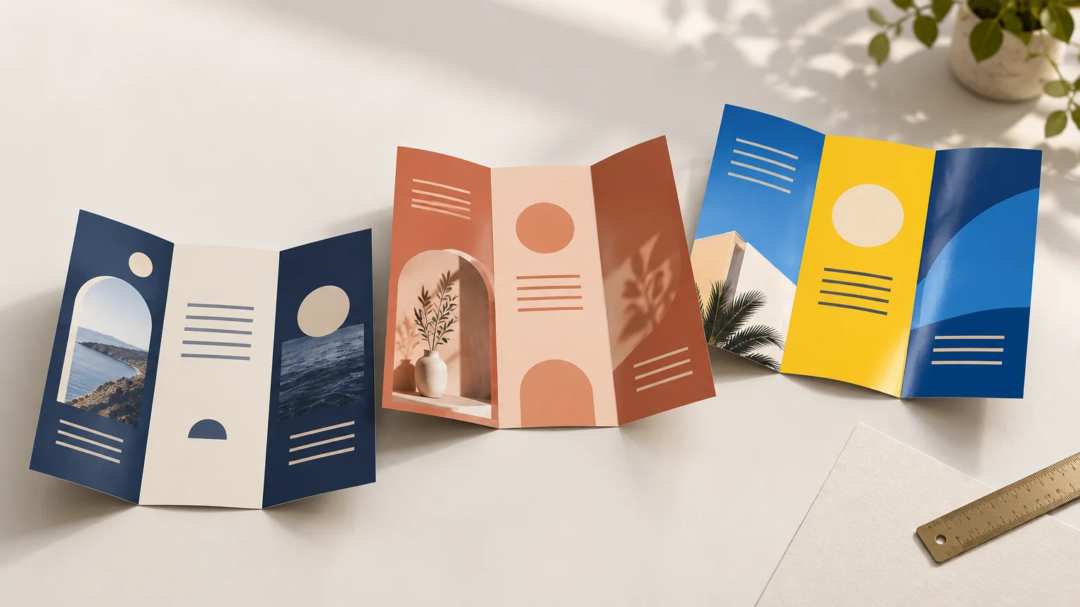
    The best paper for brochures is usually 100 lb matte or silk text stock. It feels substantial without making an ordinary trifold unnecessarily rigid, while matte or silk finishes keep service lists and contact details comfortable to read. Choose gloss when photography and saturated color lead the design, 80 lb text for economical high-volume handouts, or scored cover stock for a sturdier premium piece.

    A brochure has to do several jobs at once: look polished, fold cleanly, survive handling, and make its message easy to scan. That is why the best paper for brochures is not simply the thickest or shiniest option. The right choice depends on how the piece will be distributed, how much text it contains, and whether it should feel flexible or more like a presentation folder.

    The quick answer for common brochure projects

    Brochure job Recommended starting point Why it works Check before ordering
    Everyday service-business trifold 100 lb matte or silk text A balanced combination of polish, readability, and foldability Confirm the printer’s exact stock and folding process
    Photo-led menu, tourism piece, or portfolio 100 lb gloss or silk text Supports colorful, image-heavy layouts Check glare under the lighting where it will be read
    High-volume event or counter handout 80 lb text Lighter and often more economical for short-lived distribution Request a sample if you want to avoid a flimsy feel
    Premium sales leave-behind Cover stock with scoring Creates a more rigid, substantial piece Ask whether scoring is included and how the stock behaves with the chosen fold
    Tactile or writing-friendly brochure Uncoated text stock Offers a natural feel and accepts handwriting more comfortably Proof photographs and large areas of color on the actual stock

    These are starting specifications, not universal production rules. Printers carry different paper lines, and two stocks with similar labels may differ in thickness, stiffness, brightness, opacity, and surface character. Ask for the printer’s exact stock name or a physical sample before committing to a large run.

    Why 100 lb text is the best all-purpose starting point

    For a typical folded brochure, I would begin with 100 lb text rather than cover stock. It generally gives an everyday marketing piece enough substance to feel intentional while remaining flexible enough for common folds. Domtar places 70–100 lb text stocks among the options suited to projects with substantial graphics and print coverage, while identifying 65–100 lb cover stocks as useful for direct mail and small folded brochures. That range also illustrates why the final choice must account for the project and production method rather than weight alone.

    An 80 lb text stock can be perfectly appropriate when brochures will be handed out by the hundreds at a festival, inserted into bags, or used for a short promotion. The tradeoff is a lighter feel and potentially more show-through, depending on the specific sheet and ink coverage. If your brochure represents a higher-value service or will sit in a sales packet for months, moving to 100 lb text is usually the safer presentation choice.

    Cover stock changes the character of the piece. It can make a bifold brochure or short premium presentation feel substantial, but it can also become bulky at the fold. More stiffness is not automatically more professional; a rigid trifold that resists closing can feel less refined than a cleanly folded text-weight sheet.

    Do not compare paper by the pound number alone

    The phrase “100 lb paper” is incomplete. Text, book, and cover papers belong to different basis-weight categories, so 100 lb text and 100 lb cover are not two versions of the same physical thickness. A 100 lb cover sheet is substantially different from a 100 lb text sheet. Taylor’s paper-weight guide specifically distinguishes the text/book and cover categories and warns against treating identical pound labels as equivalent.

    Basis weight is traditionally calculated from the weight of 500 sheets at a category-specific standard sheet size. Because those standard sizes differ between paper categories, the pound value is not a simple cross-category thickness measurement. French Paper’s guide to paper weights explains this system and identifies text-weight sheets as a common choice for brochures.

    When comparing printer quotes, ask each supplier to identify the stock family and finish—not merely “100 lb.” If available, compare caliper or thickness, but remember that stiffness and surface can still affect how two similarly thick sheets feel. A physical sample with an actual fold is more revealing than a label on a quotation.

    Choose the finish around the reader, not the showroom shine

    Paper finish changes both the visual personality and the practical reading experience. Sappi lists coated-paper finishes that include gloss, dull, silk, and matte, describing matte as non-reflective and silk as a balance between image reproduction and readability.

    Gloss for photography and energetic color

    Gloss is a natural fit for restaurant dishes, destinations, products, vehicles, interiors, and other subjects where vivid photography carries the message. It can make color feel lively, but reflected light may interfere with smaller type. A glossy brochure under bright retail lights deserves larger text, comfortable spacing, and strong contrast.

    Matte for text-heavy business communication

    Matte is a dependable choice for professional-services brochures, health and community information, class schedules, and any layout containing several paragraphs or detailed lists. Its restrained surface helps the information feel calm and approachable. It can still reproduce photography well, although it will not create the same shiny effect as gloss.

    Silk or satin for the middle ground

    Silk and satin finishes sit between high gloss and flat matte, although the terminology varies among paper manufacturers and printers. They suit brochures that mix photographs with substantial copy: property information, venue packages, trade services, tourism pieces, and capability overviews are good examples. If a printer offers both silk and satin, inspect samples instead of assuming the names represent standardized surfaces.

    Uncoated for texture and writing

    Uncoated stock can make a brochure feel tactile, understated, or craft-oriented. It is also the practical choice when staff or customers need to write on the piece. The tradeoff is that photographs and large solid colors can appear different from their screen previews or coated-paper equivalents. Requesting a printed proof is particularly useful when the design relies on subtle photos, dark backgrounds, or exact brand colors.

    Plan the fold before approving the paper

    A stock can look excellent as a flat sample and still be wrong for the finished brochure. Trifolds, bifolds, z-folds, gatefolds, and multi-panel pieces place different demands on the sheet. Heavier and coated stocks may need scoring—a controlled indentation made before folding—to reduce cracking and produce a cleaner crease.

    Grain direction matters too. Paper generally folds more cleanly when the fold runs parallel to the grain, a practice recommended in French Paper’s paper-weight guidance. The printer should handle that production decision, but it is worth discussing when you are using a heavy stock, a dark design crossing the fold, or an unusual format.

    Ask these questions before placing the order:

    • Is the quoted paper text stock or cover stock?
    • What is the exact weight, finish, and stock name?
    • Is the selected paper appropriate for this fold pattern?
    • Does the job include scoring, and does the printer recommend it?
    • Will dark ink or photography crossing a fold be vulnerable to visible cracking?
    • Can I see a folded sample, stock swatch, or printed proof?

    A worked choice for a service-business trifold

    Imagine a landscape trifold for a local cleaning company. The front panel contains a logo, photograph, and short promise. Inside are three service categories, a few supporting images, contact details, and a clear booking call to action.

    For that project, I would specify 100 lb matte or silk text as the starting point. The brochure needs enough body to feel credible at an estimate or community event, but it also needs to fold neatly and remain easy to hold open. Matte is the stronger choice if service details dominate. Silk becomes attractive if before-and-after photography is equally important.

    I would not jump to cover stock unless the brochure is intended as a premium sales leave-behind and the printer confirms that the selected sheet will score and fold well. I would use 80 lb text only when distribution volume and budget matter more than long-term durability.

    Paper cannot rescue a crowded layout, so the file still needs correct dimensions, bleed, safe margins, and usable image resolution. The preparation steps in this guide to professional print artwork help prevent paper choice from being overshadowed by trimming or color problems.

    What changes when the brochure will be mailed?

    A mailed brochure is no longer only a paper-selection project. Its finished size, fold orientation, closure method, stiffness, address area, and processing category may affect production and postage. USPS publishes standards for commercial letter mail and mailing-piece design, but the applicable requirements depend on the exact format and can change.

    Before designing a self-mailer, show the planned finished dimensions, stock, fold sequence, and mailing quantity to both the printer and the mailing provider. Do not assume that a heavier sheet or a familiar trifold format automatically meets current postal requirements.

    Your brochure paper pre-order checklist

    1. Define the job: disposable handout, everyday sales brochure, mailed piece, or premium leave-behind.
    2. Decide whether photographs or detailed copy should receive visual priority.
    3. Choose text stock for flexible everyday brochures or consider scored cover stock for a more rigid piece.
    4. Select gloss for image emphasis, matte for reduced glare, silk for balance, or uncoated for texture and writing.
    5. Give the printer the final fold style before approving the stock.
    6. Ask whether scoring is included or recommended.
    7. Request an actual sample or proof when color, texture, folding, or perceived quality is important.
    8. Confirm that the quote states both the paper category and finish.
    9. Compare general custom-printing options only after defining these specifications, so you are evaluating equivalent products rather than similar-sounding weight labels.

    The simplest decision rule

    Start with 100 lb matte or silk text for an everyday folded business brochure. Move to gloss when photography should command attention, down to 80 lb text for economical high-volume distribution, or up to a properly scored cover stock when rigidity is part of the intended experience.

    Then verify the decision with the printer’s physical sample and folding recommendation. The best brochure paper is the sheet that supports the message, survives its real distribution method, and folds into a polished object—not necessarily the option with the biggest number or brightest shine.

    References

    1. Basis Weight Basics – Domtar
    2. Update Document Title
    3. French Paper’s Guide to Paper Weights
    4. Digital Printing Papers | Sappi
    5. 200 Commercial Letters, Flats, and Parcels Design Standards | Postal Explorer
    6. Publication 25, Designing Letter and Reply Mail

  • Best Paper for Business Cards

    Best Paper for Business Cards

    TLDR

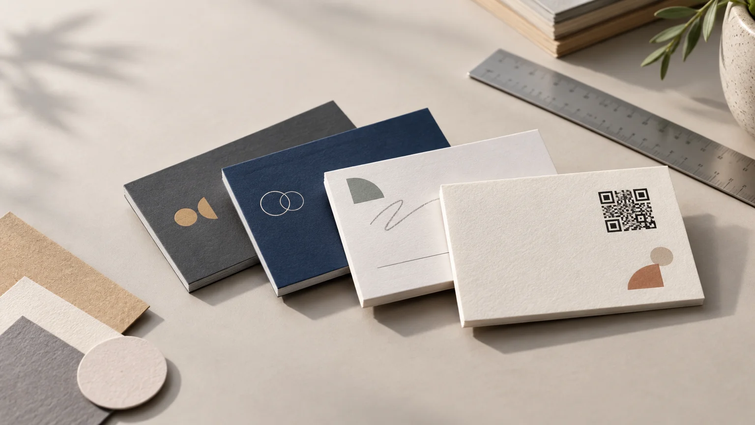
    The best paper for business cards is 16 pt smooth cardstock with a matte finish—or the printer’s comparable silk or satin option—for most small businesses. It feels substantial without making the project needlessly expensive, keeps text readable, and works with a wide range of designs. Choose gloss when photographs and saturated color are the priority, confirmed writable stock for appointment notes, and thicker or textured paper when the tactile experience is an important part of the brand.

    Paper choice matters, but heavier is not automatically better. A clean 16 pt card with readable type and a sensible finish can look more professional than an ultra-thick card with cramped artwork. Start with how the card will be used, then choose the stock, coating, and finish that support that job.

    The best paper for business cards by use case

    Business-card use Good starting choice Main tradeoff
    Everyday networking and service businesses 16 pt smooth matte or silk cardstock A versatile choice, but less visually dramatic than gloss or specialty stock
    Photography, food, beauty, or product imagery Smooth coated stock with gloss on the image-heavy side Reflections can make small text or QR codes harder to view in some lighting
    Appointment, loyalty, or referral cards Uncoated or printer-confirmed writable stock Colors may appear softer than on a glossy coated surface
    Natural, craft, or community-focused branding Uncoated or lightly textured cover stock Texture can reduce the crispness of very small type and fine detail
    Consulting, boutique, or premium introductions Thicker stock or a restrained specialty finish Higher cost and fewer compatible finishing options
    Cards with QR codes Smooth, low-glare stock with strong contrast The code still requires physical testing; paper choice cannot rescue a poorly sized code

    This table is a starting point, not a universal material standard. Printers use terms such as silk, satin, matte, velvet, and soft touch differently. Read the product specification and order a sample when surface feel matters.

    Make three decisions: thickness, coating, and finish

    1. Choose enough thickness for the job

    For an ordinary business card, 16 pt is a sensible middle ground. It generally communicates more substance than a lightweight promotional card while remaining appropriate for cards that will be handed out frequently. A sturdier option such as 18 pt can add presence, while an unusually thick card is best reserved for a deliberate premium effect.

    Current product specifications illustrate how broad this range can be: MOO lists examples including 16 pt Original cards, 18 pt Super cards, and 32 pt or 600 gsm Luxe cards. Those numbers describe specific products, not universal quality grades that every printer follows.

    Do not compare pound weights without context. The meaning of a pound value depends on the paper category and its starting sheet size, so text and cover papers with the same stated weight are not necessarily equivalent. Mohawk’s explanation of paper weight and paper selection is a useful reference when a printer lists stock in lb rather than points.

    Gsm is another useful specification, but it measures mass per area rather than caliper. That is why 350 gsm should not automatically be treated as an exact substitute for 16 pt. Fiber composition, compression, coating, and construction can change how two stocks with similar headline numbers feel. Compare samples or the printer’s complete specifications instead of relying on a conversion chart alone.

    2. Decide whether the surface should be coated

    Coated stock provides a smoother printing surface and often supports crisp color and detail. It is a strong fit for polished logos, dark backgrounds, photographs, and cards intended to feel sleek. The downside is that coated surfaces may be difficult to write on, depending on the exact coating and pen.

    Uncoated stock has a more natural paper feel. It is often the better direction for cards that need handwritten appointment times, loyalty marks, referral names, or personal notes. It can also complement brands built around craft, warmth, sustainability, or understated professionalism. However, do not assume every product labeled matte is writable. Matte can describe a coated surface, and laminates can resist ordinary pens. Confirm writability with the printer and test the pen you expect staff or customers to use.

    3. Pick a finish that supports the design

    Matte is the safest all-purpose finish because it avoids strong glare and lets typography remain the main event. MOO describes matte as smooth and glare-free, while positioning gloss as a finish that makes color and photography more eye-catching. A printer’s silk or satin option may sit between flat matte and shiny gloss, but the terminology is not consistent enough to order by name alone.

    • Matte or silk: Choose this for clear type, versatile branding, headshots, logos, and cards viewed under mixed lighting.
    • Gloss: Choose this when rich photography or product imagery needs extra visual punch. Consider using it on only one side if the reverse must be easy to read or write on.
    • Uncoated: Choose this for a natural tactile quality or a card that needs notes, stamps, or appointment details.
    • Soft touch: Choose this when a velvety surface reinforces a premium or design-conscious brand. Be aware that scuffs, fingerprints, fine detail, and writability can vary by product.
    • Textured stock: Choose this for restrained designs with larger type and simple marks. Fine lines and tiny lettering may compete with a pronounced texture.

    Select specialty effects only after choosing the base stock. Foil, raised effects, spot gloss, and other embellishments may be restricted to particular card materials or product lines. MOO, for example, associates certain special finishes with specific card products. Confirm compatibility before building the artwork around an effect that the chosen stock cannot accept.

    Match the paper to what the card must do

    For trades, local services, and everyday networking

    Use 16 pt matte or silk cardstock and spend the design effort on hierarchy: business name, service, contact method, and a short reason to keep the card. An electrician, cleaner, landscaper, or consultant usually gains more from immediate clarity than from exotic paper.

    For restaurants and image-led businesses

    A smooth coated stock can help food, interiors, artwork, beauty services, and products appear polished. Gloss is useful when imagery is the card’s main selling point, but it does not need to cover both sides. A glossy image front and lower-glare information side can create a practical balance if the printer offers that combination.

    For appointment and loyalty cards

    Treat writing performance as a requirement, not a bonus. Ask whether the relevant side is uncoated or explicitly approved for writing, and test common ballpoint, gel, and permanent pens on a sample. Leave a generous blank area; a writable surface is not useful if the design fills every available space.

    For premium or tactile brands

    Thicker, textured, duplexed, or soft-touch cards can be worthwhile when personal presentation is central to the sale. A boutique studio, wedding professional, architect, or high-value adviser may reasonably want the handoff to feel distinctive. Keep the artwork restrained so the material has room to make an impression. If cards are distributed casually in large quantities, that extra cost may be better spent on more cards or a stronger design.

    What paper works best with a QR code?

    Choose a smooth, relatively low-glare surface, but focus first on code design and testing. Adobe recommends adequate contrast and clear quiet space around a QR code, warns against visually busy or reflective contexts, and advises testing the physical printed code at its actual size. Adobe’s QR code design guidance is useful before final export.

    • Use a dark code on a light, uncluttered background.
    • Keep logos, borders, text, and patterns out of the required clear area.
    • Add a short call to action such as “Book an appointment” or “View the menu.”
    • Print a proof at the final card size rather than testing only on screen.
    • Scan it with several phones under bright light, dim indoor light, and angled light.
    • Confirm that the destination is mobile-friendly and unlikely to change.

    A glossy card can still carry a working QR code, but reflections introduce another variable. If the code is important to the card’s purpose, a matte information side is the simpler choice.

    Do not let good paper hide a weak print file

    Premium stock cannot fix undersized images, text placed too close to the trim, missing bleed, or an incorrect document size. Build the file to the printer’s template and verify the final dimensions before ordering. For a fuller preflight process, use this guide to prepare artwork for professional printing without color or cut surprises.

    If you plan to print cards in-house, check the exact printer model’s supported media weights, media settings, and feed path. Epson’s documentation demonstrates that supported cardstock weights and settings vary by device. A stock that works in one desktop printer may jam, curl, or feed poorly in another.

    Business-card paper ordering checklist

    • Thickness: Is the stock listed in pt, gsm, or lb, and are you comparing the same measurement across options?
    • Surface: Is each side coated, uncoated, laminated, textured, or otherwise treated?
    • Writability: Has the printer confirmed it, and have you tested the pen you will actually use?
    • Finish compatibility: Can the chosen stock accept foil, raised effects, spot gloss, rounded corners, or other requested options?
    • Design fit: Will tiny type, fine lines, photographs, or large dark areas reproduce well on that surface?
    • QR performance: Has a physical proof been scanned at final size in realistic lighting?
    • File setup: Does the artwork follow the printer’s trim, bleed, safe-area, color, and export requirements?
    • Samples: Can you order or request a stock sample before committing to a larger quantity?
    • Proof: Have you checked names, titles, phone numbers, URLs, and QR destinations one final time?

    The straightforward recommendation

    For most small businesses, start with 16 pt smooth cardstock in matte or the printer’s comparable silk finish. It is a dependable choice for readable typography, logos, moderate imagery, and everyday handouts.

    Move away from that default for a specific reason: use gloss to emphasize photographs, verified writable or uncoated stock for notes, low-glare stock for an important QR code, and thicker or textured material when tactile presentation genuinely supports the brand. Before placing a large order, inspect the specification, request a sample, and print or order a physical proof. The best card is not simply the thickest one—it is the one whose paper, finish, and design all make the business easier to remember and contact.

    References

    1. Business Cards – Make Your Own Professional Business Cards Online | MOO (United States)
    2. Business Card, Super, Standard, Soft Touch, Square Corner, No Special Finish | MOO
    3. support.moo.com
    4. Choosing the Right Paper for the Right Job | Mohawk Connects
    5. Choosing the best paper for Business Cards – MOO Blog
    6. QR Code Best Practices to Create QR Codes That Work | Adobe Express
    7. Paper or Media Type Settings – Printing Software