TLDR
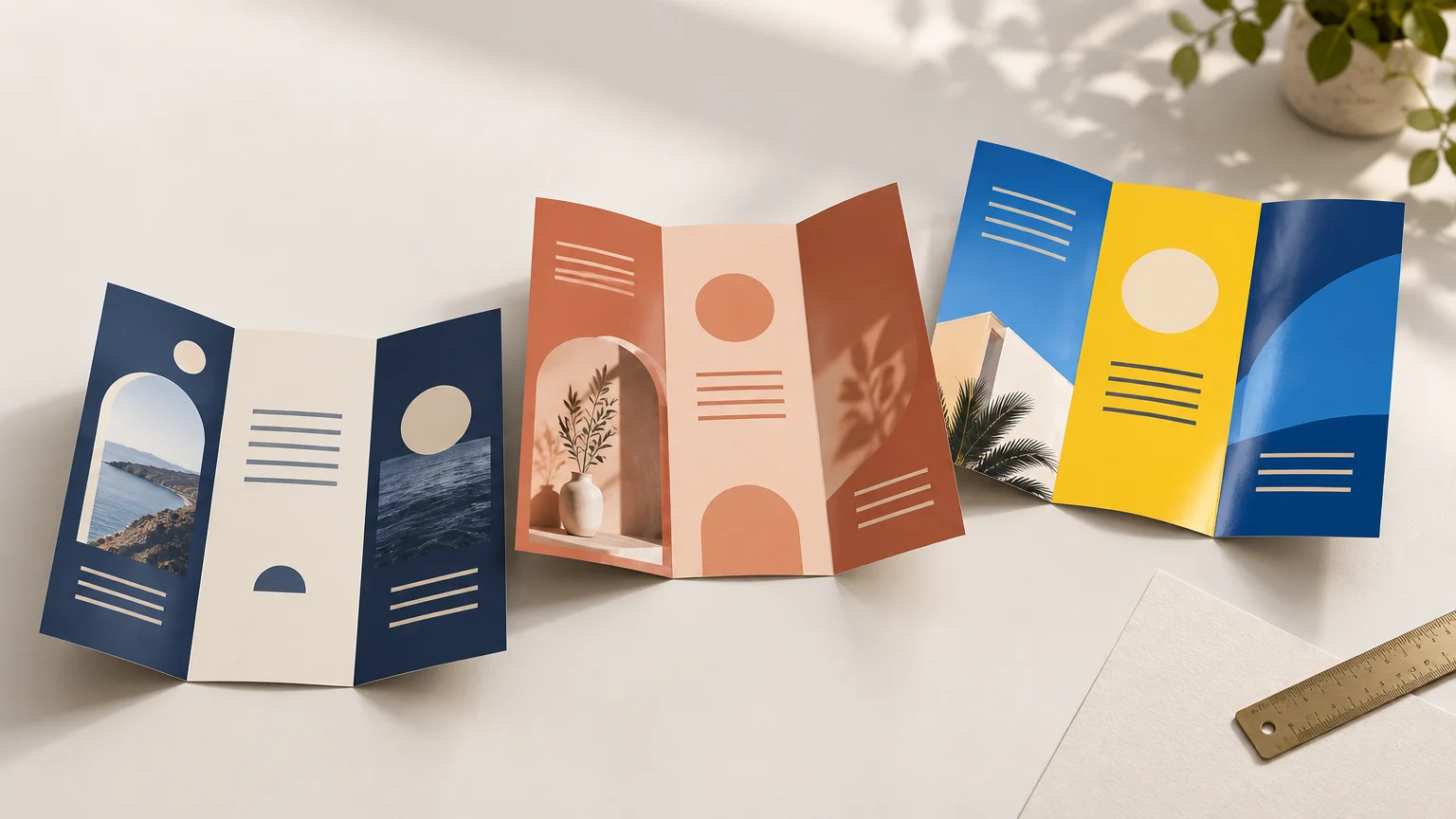
The best paper for brochures is usually 100 lb matte or silk text stock. It feels substantial without making an ordinary trifold unnecessarily rigid, while matte or silk finishes keep service lists and contact details comfortable to read. Choose gloss when photography and saturated color lead the design, 80 lb text for economical high-volume handouts, or scored cover stock for a sturdier premium piece.
A brochure has to do several jobs at once: look polished, fold cleanly, survive handling, and make its message easy to scan. That is why the best paper for brochures is not simply the thickest or shiniest option. The right choice depends on how the piece will be distributed, how much text it contains, and whether it should feel flexible or more like a presentation folder.
The quick answer for common brochure projects
| Brochure job | Recommended starting point | Why it works | Check before ordering |
|---|---|---|---|
| Everyday service-business trifold | 100 lb matte or silk text | A balanced combination of polish, readability, and foldability | Confirm the printer’s exact stock and folding process |
| Photo-led menu, tourism piece, or portfolio | 100 lb gloss or silk text | Supports colorful, image-heavy layouts | Check glare under the lighting where it will be read |
| High-volume event or counter handout | 80 lb text | Lighter and often more economical for short-lived distribution | Request a sample if you want to avoid a flimsy feel |
| Premium sales leave-behind | Cover stock with scoring | Creates a more rigid, substantial piece | Ask whether scoring is included and how the stock behaves with the chosen fold |
| Tactile or writing-friendly brochure | Uncoated text stock | Offers a natural feel and accepts handwriting more comfortably | Proof photographs and large areas of color on the actual stock |
These are starting specifications, not universal production rules. Printers carry different paper lines, and two stocks with similar labels may differ in thickness, stiffness, brightness, opacity, and surface character. Ask for the printer’s exact stock name or a physical sample before committing to a large run.
Why 100 lb text is the best all-purpose starting point
For a typical folded brochure, I would begin with 100 lb text rather than cover stock. It generally gives an everyday marketing piece enough substance to feel intentional while remaining flexible enough for common folds. Domtar places 70–100 lb text stocks among the options suited to projects with substantial graphics and print coverage, while identifying 65–100 lb cover stocks as useful for direct mail and small folded brochures. That range also illustrates why the final choice must account for the project and production method rather than weight alone.
An 80 lb text stock can be perfectly appropriate when brochures will be handed out by the hundreds at a festival, inserted into bags, or used for a short promotion. The tradeoff is a lighter feel and potentially more show-through, depending on the specific sheet and ink coverage. If your brochure represents a higher-value service or will sit in a sales packet for months, moving to 100 lb text is usually the safer presentation choice.
Cover stock changes the character of the piece. It can make a bifold brochure or short premium presentation feel substantial, but it can also become bulky at the fold. More stiffness is not automatically more professional; a rigid trifold that resists closing can feel less refined than a cleanly folded text-weight sheet.
Do not compare paper by the pound number alone
The phrase “100 lb paper” is incomplete. Text, book, and cover papers belong to different basis-weight categories, so 100 lb text and 100 lb cover are not two versions of the same physical thickness. A 100 lb cover sheet is substantially different from a 100 lb text sheet. Taylor’s paper-weight guide specifically distinguishes the text/book and cover categories and warns against treating identical pound labels as equivalent.
Basis weight is traditionally calculated from the weight of 500 sheets at a category-specific standard sheet size. Because those standard sizes differ between paper categories, the pound value is not a simple cross-category thickness measurement. French Paper’s guide to paper weights explains this system and identifies text-weight sheets as a common choice for brochures.
When comparing printer quotes, ask each supplier to identify the stock family and finish—not merely “100 lb.” If available, compare caliper or thickness, but remember that stiffness and surface can still affect how two similarly thick sheets feel. A physical sample with an actual fold is more revealing than a label on a quotation.
Choose the finish around the reader, not the showroom shine
Paper finish changes both the visual personality and the practical reading experience. Sappi lists coated-paper finishes that include gloss, dull, silk, and matte, describing matte as non-reflective and silk as a balance between image reproduction and readability.
Gloss for photography and energetic color
Gloss is a natural fit for restaurant dishes, destinations, products, vehicles, interiors, and other subjects where vivid photography carries the message. It can make color feel lively, but reflected light may interfere with smaller type. A glossy brochure under bright retail lights deserves larger text, comfortable spacing, and strong contrast.
Matte for text-heavy business communication
Matte is a dependable choice for professional-services brochures, health and community information, class schedules, and any layout containing several paragraphs or detailed lists. Its restrained surface helps the information feel calm and approachable. It can still reproduce photography well, although it will not create the same shiny effect as gloss.
Silk or satin for the middle ground
Silk and satin finishes sit between high gloss and flat matte, although the terminology varies among paper manufacturers and printers. They suit brochures that mix photographs with substantial copy: property information, venue packages, trade services, tourism pieces, and capability overviews are good examples. If a printer offers both silk and satin, inspect samples instead of assuming the names represent standardized surfaces.
Uncoated for texture and writing
Uncoated stock can make a brochure feel tactile, understated, or craft-oriented. It is also the practical choice when staff or customers need to write on the piece. The tradeoff is that photographs and large solid colors can appear different from their screen previews or coated-paper equivalents. Requesting a printed proof is particularly useful when the design relies on subtle photos, dark backgrounds, or exact brand colors.
Plan the fold before approving the paper
A stock can look excellent as a flat sample and still be wrong for the finished brochure. Trifolds, bifolds, z-folds, gatefolds, and multi-panel pieces place different demands on the sheet. Heavier and coated stocks may need scoring—a controlled indentation made before folding—to reduce cracking and produce a cleaner crease.
Grain direction matters too. Paper generally folds more cleanly when the fold runs parallel to the grain, a practice recommended in French Paper’s paper-weight guidance. The printer should handle that production decision, but it is worth discussing when you are using a heavy stock, a dark design crossing the fold, or an unusual format.
Ask these questions before placing the order:
- Is the quoted paper text stock or cover stock?
- What is the exact weight, finish, and stock name?
- Is the selected paper appropriate for this fold pattern?
- Does the job include scoring, and does the printer recommend it?
- Will dark ink or photography crossing a fold be vulnerable to visible cracking?
- Can I see a folded sample, stock swatch, or printed proof?
A worked choice for a service-business trifold
Imagine a landscape trifold for a local cleaning company. The front panel contains a logo, photograph, and short promise. Inside are three service categories, a few supporting images, contact details, and a clear booking call to action.
For that project, I would specify 100 lb matte or silk text as the starting point. The brochure needs enough body to feel credible at an estimate or community event, but it also needs to fold neatly and remain easy to hold open. Matte is the stronger choice if service details dominate. Silk becomes attractive if before-and-after photography is equally important.
I would not jump to cover stock unless the brochure is intended as a premium sales leave-behind and the printer confirms that the selected sheet will score and fold well. I would use 80 lb text only when distribution volume and budget matter more than long-term durability.
Paper cannot rescue a crowded layout, so the file still needs correct dimensions, bleed, safe margins, and usable image resolution. The preparation steps in this guide to professional print artwork help prevent paper choice from being overshadowed by trimming or color problems.
What changes when the brochure will be mailed?
A mailed brochure is no longer only a paper-selection project. Its finished size, fold orientation, closure method, stiffness, address area, and processing category may affect production and postage. USPS publishes standards for commercial letter mail and mailing-piece design, but the applicable requirements depend on the exact format and can change.
Before designing a self-mailer, show the planned finished dimensions, stock, fold sequence, and mailing quantity to both the printer and the mailing provider. Do not assume that a heavier sheet or a familiar trifold format automatically meets current postal requirements.
Your brochure paper pre-order checklist
- Define the job: disposable handout, everyday sales brochure, mailed piece, or premium leave-behind.
- Decide whether photographs or detailed copy should receive visual priority.
- Choose text stock for flexible everyday brochures or consider scored cover stock for a more rigid piece.
- Select gloss for image emphasis, matte for reduced glare, silk for balance, or uncoated for texture and writing.
- Give the printer the final fold style before approving the stock.
- Ask whether scoring is included or recommended.
- Request an actual sample or proof when color, texture, folding, or perceived quality is important.
- Confirm that the quote states both the paper category and finish.
- Compare general custom-printing options only after defining these specifications, so you are evaluating equivalent products rather than similar-sounding weight labels.
The simplest decision rule
Start with 100 lb matte or silk text for an everyday folded business brochure. Move to gloss when photography should command attention, down to 80 lb text for economical high-volume distribution, or up to a properly scored cover stock when rigidity is part of the intended experience.
Then verify the decision with the printer’s physical sample and folding recommendation. The best brochure paper is the sheet that supports the message, survives its real distribution method, and folds into a polished object—not necessarily the option with the biggest number or brightest shine.