Category: Default

  • Best Labels for Subscription Boxes

    Best Labels for Subscription Boxes

    TLDR

    The best labels for subscription boxes depend on where and how the label will be used.

    Use a durable branded label on the outside of the box, a carrier-approved shipping label for delivery, roll or sheet labels for individual products, and smaller stickers for tissue paper, inserts, or box seals. Test every label on the actual packaging before ordering a large quantity.

    A customer sees the box before they see anything inside it.

    That first impression does not require an expensive custom-printed mailer. A plain box with a clean, well-placed label can look intentional, recognizable, and ready to open.

    The best labels for subscription boxes also do more than display a logo. They help identify products, organize fulfillment, protect packages, share instructions, and guide subscribers toward their next action. The right setup is usually a small system of labels rather than one sticker trying to do every job.

    What Are the Best Labels for Subscription Boxes?

    For most subscription businesses, the best label setup includes four parts:

    1. A branded exterior box label
    2. A standard shipping label
    3. Product or inventory labels
    4. An interior seal or thank-you sticker

    Additional labels may be useful for QR codes, product care instructions, allergens, sizes, scents, flavors, batch numbers, or limited-edition items.

    Here is a practical starting point:

    Label UseRecommended FormatBest For
    Exterior box brandingDurable vinyl or plastic labelLogos, box branding, monthly themes
    Product identificationRoll or sheet labelsNames, variants, ingredients, instructions
    Shipping informationDirect thermal shipping labelAddresses, tracking, carrier barcodes
    Tissue or box sealPaper or vinyl stickerSealing tissue, envelopes, and inner packaging
    QR code labelMatte or low-glare labelInstructions, videos, account pages, reorder links
    Security sealTamper-evident or permanent labelHigh-value, regulated, or sensitive products
    Customer freebieIndividual die-cut stickerBrand awareness and subscriber gifts

    The exact combination depends on what is being shipped. A snack subscription, book box, cosmetics kit, and hobby crate will not need identical labeling.

    But each label should have one clear purpose.

    Branded Exterior Labels Are the Best Starting Point

    A large exterior label is often the most useful label for a new subscription box business.

    It allows the company to order standard corrugated boxes and add its branding later. That is helpful when order volume is still changing or when the business uses several box sizes.

    Exterior box labels can include:

    • The company logo
    • A short brand message
    • The subscription box name
    • A seasonal design
    • A monthly theme
    • Social media information
    • A simple call to action
    • Handling or opening instructions

    Keep the design clear. A customer should be able to recognize the brand without stopping to read a paragraph.

    For most boxes, a circle, square, rectangle, or simple die-cut logo works well. Highly detailed shapes can look interesting, but they may take longer to apply and can have narrow areas that lift more easily from textured cardboard.

    Durable packaging and label stickers are a practical option when the exterior label may encounter abrasion, moisture, or repeated handling during delivery. CustomStickers.com offers laminated vinyl packaging stickers with permanent adhesive and resistance to water and oil.

    Roll Labels Work Best for Repeated Packing

    Roll labels are generally the best option when the same design must be applied hundreds or thousands of times.

    The roll format keeps labels organized and makes them quick to peel. It can support hand application at a packing table or machine application as the subscription business grows.

    Good uses for roll labels include:

    • Branding the outside of every box
    • Labeling bottles, jars, tins, or pouches
    • Marking product variants
    • Sealing tissue paper
    • Adding batch or flavor information
    • Identifying monthly themes
    • Applying the same QR code to every shipment

    Custom roll labels may be available in paper, white plastic, and transparent plastic materials. Die-cut roll labels can also follow a custom shape rather than using a standard circle or rectangle.

    Roll labels make the most sense when the design is settled. If the branding, product lineup, or box size changes every month, ordering a large roll of one permanent design may create waste.

    Sheet Labels Are Better for Small Runs and Many Variants

    Sheet labels are useful when a business needs flexibility.

    A sheet can contain one repeated design or several different labels. That makes sheet labels a good choice for small subscription programs, test boxes, seasonal products, and businesses that pack several variants at the same station.

    For example, a beauty subscription box may need labels for:

    • Dry skin
    • Oily skin
    • Sensitive skin
    • Fragrance-free
    • Light, medium, and deep shades

    A snack box might use one sheet containing separate labels for allergens, spice levels, product names, and expiration dates.

    Sheet labels are also easier to store in a filing cabinet or flat packaging drawer. They do not require a label dispenser, and packers can see several designs at once.

    CustomStickers.com offers custom labels in both roll and sheet formats. Its die-cut sheet labels are printed on sheets and use vinyl designed to withstand exposure to oil, water, heat, food, and refrigeration.

    Shipping Labels Should Stay Separate From Branding Labels

    A shipping label is an operational label. Its main job is to help the carrier route and deliver the package.

    Do not redesign the carrier label to match the rest of the packaging. Do not add decorative patterns behind the barcode or place promotional stickers where they could interfere with scanning.

    Instead, reserve a flat, open area of the box for the shipping label. Then place the branded subscription box label elsewhere.

    For USPS packages, the shipping label should be placed parallel to the longest side of the package. USPS also advises keeping labels on the same side and avoiding folds, overlaps, or placement over an edge.

    A simple box layout might use:

    • Shipping label on the upper-right section
    • Brand label on the upper-left section
    • Security seal across the front opening
    • Handling information on a side panel

    Create a placement guide for packers. It prevents labels from moving around from shipment to shipment and keeps the presentation consistent.

    Box Seal Labels Add Branding and Function

    A seal sticker can close tissue paper, hold an envelope shut, or bridge the opening of a subscription box.

    This small label tells the customer where to open the packaging. It can also make the contents feel organized without adding another printed box or insert.

    Good seal messages include:

    • Packed for you
    • Open here
    • Your monthly box has arrived
    • Made with care
    • Thanks for subscribing
    • Start here
    • A little something for you

    A permanent sticker can provide a stronger seal, but it may tear tissue paper or leave residue on reusable packaging. A lighter paper sticker may be enough when the purpose is mainly decorative.

    Do not use a standard decorative sticker as a security claim. A normal sticker can show that a flap was closed, but it is not necessarily tamper-evident.

    Products that require visible evidence of opening may need a material designed specifically for tamper detection.

    Product Labels Keep the Box Easy to Understand

    A subscription box can contain several unfamiliar products. Good product labels prevent customers from guessing what everything is.

    A product label may include:

    • Product name
    • Brand name
    • Size or quantity
    • Flavor, color, or scent
    • Instructions
    • Ingredients
    • Allergens
    • Care information
    • Expiration or best-by date
    • Batch number
    • Country of origin
    • Required warnings

    Some of that information may be legally required depending on the product. Food, cosmetics, supplements, candles, children’s products, and household chemicals can have different labeling requirements.

    The subscription box label should not replace required product labeling. If a box contains third-party goods, keep the manufacturer’s original labels visible unless the business has a valid reason and process for replacing them.

    For curated items, a small secondary label can explain why the product was selected or how it fits the month’s theme.

    QR Code Labels Can Reduce Packaging Clutter

    A QR code can move secondary information off the box and onto a webpage.

    Useful destinations include:

    • A subscriber account page
    • Setup instructions
    • A demonstration video
    • Recipes
    • Product care guidance
    • A playlist
    • A reading guide
    • A monthly digital booklet
    • Reorder information
    • Referral rewards
    • Feedback forms

    Send the customer to a specific page. A QR code that leads to the company homepage usually makes the customer search for the information all over again.

    Keep the code away from folds, corners, textured areas, and reflective finishes. Use strong contrast and leave open space around the code.

    Test the printed label with several phones before approving a large order. Scan it in bright light, dim light, and while the label is attached to the actual box.

    Choose Label Materials Based on the Surface

    The package surface matters as much as the design.

    Corrugated cardboard can be rough, dusty, recycled, coated, or uncoated. A label that works on a smooth white mailer may not perform the same way on a textured kraft box.

    Paper Labels

    Paper labels work well for dry interior packaging, tissue seals, envelopes, and brands that want a softer printed look.

    They are not usually the first choice for packages exposed to moisture, oil, or heavy handling.

    White Plastic or BOPP Labels

    Plastic labels are a practical choice for product packaging and exterior branding. They generally handle moisture and routine abrasion better than basic paper.

    A white background also keeps printed colors consistent across brown, black, or colored boxes.

    Clear Labels

    Clear labels can create a printed-on-box appearance, especially on smooth white or light-colored packaging.

    But the box color will affect the design. Transparent areas disappear into the package, and dark cardboard can make colors or small text hard to read. White ink under the design may be needed to preserve contrast.

    Clear labels also show trapped dust, fibers, and application bubbles more easily. The surface should be clean before application.

    Vinyl Stickers

    Laminated vinyl is useful for durable exterior branding, promotional stickers, and customer freebies.

    It may be more material than necessary for a simple interior tissue seal, but it works well when the sticker needs to survive after the box is opened.

    Match the Label Size to the Box

    A label should look deliberate rather than lost or oversized.

    Start by measuring the flat printable area of the box. Do not measure across seams, folds, tape, or openings.

    Then print the proposed design on ordinary paper at actual size. Cut it out and place it on the box.

    Check it from several distances.

    A small logo may look refined on a computer screen but nearly disappear on a large shipping box. A large label may look strong from the front but leave no clear space for postage.

    Useful starting ranges include:

    • 1 to 2 inches for tissue seals and small product labels
    • 2 to 3 inches for jar labels, pouches, and small mailers
    • 3 to 5 inches for exterior subscription box branding
    • Larger rectangular labels for box-top artwork or detailed information

    These are starting points, not fixed rules. The design, message, and box proportions matter more than choosing a standard size.

    Build a Consistent Subscription Box Label System

    Consistency makes separate labels feel like part of one package.

    Use the same:

    • Logo treatment
    • Primary fonts
    • Brand colors
    • Illustration style
    • Border style
    • Tone of voice
    • Icon system
    • General layout

    But give each label a different job.

    The exterior label can focus on recognition. The product label can focus on information. The tissue seal can be personal. The QR code label can direct an action.

    Trying to fit the logo, product list, social handles, thank-you message, QR code, referral offer, care instructions, and legal copy onto one sticker usually produces a small square of administrative panic.

    Separate the information instead.

    Design Labels for Fast Fulfillment

    Good packaging should be easy for employees to assemble correctly.

    A label design may look excellent but still create problems if packers cannot distinguish similar products or peel labels quickly.

    Before ordering, consider:

    • How many labels go on each box?
    • In what order are they applied?
    • Are different variants easy to distinguish?
    • Can labels be peeled while wearing gloves?
    • Will one roll be confused with another?
    • Where will label inventory be stored?
    • Can the design be applied straight without measuring?
    • Does the box need space for a packing slip or return label?

    Color coding can help, but do not rely on color alone. Add clear product names, initials, numbers, or symbols.

    For example, a candle subscription might use:

    • Blue plus “OCEAN”
    • Green plus “FOREST”
    • Orange plus “CITRUS”

    That is easier to verify than three labels that differ only by a subtle color shift.

    Common Subscription Box Label Mistakes

    Using One Label for Everything

    Branding, shipping, safety, product identification, and customer messaging are different tasks. Separate them when necessary.

    Applying Labels Over Seams

    Labels placed over box openings, folds, or edges are more likely to lift, tear, or interfere with opening.

    Ordering Before Testing the Box

    Always test the label on the exact box material. A digital mockup cannot show texture, adhesive performance, or real printed scale.

    Making Text Too Small

    Customers should not need a phone camera to read ordinary product instructions.

    Overusing Specialty Finishes

    Holographic, glitter, chrome, and clear materials can work well for the right subscription theme. They become distracting when every label competes for attention.

    Linking a QR Code to the Homepage

    Send subscribers directly to the instructions, offer, or monthly content promised by the label.

    Forgetting the Shipping Label Area

    Plan branding around the carrier label, not the other way around.

    Subscription Box Label Checklist

    Before approving a subscription box label order, confirm that:

    • Every label has one clear job
    • The correct label material was selected
    • The adhesive was tested on the actual packaging
    • The label fits on a flat surface
    • The design leaves room for the shipping label
    • Small text is readable at printed size
    • QR codes scan from the finished package
    • Product variants are easy to identify
    • Required information has been reviewed
    • Roll direction works with the packing process
    • Colors have enough contrast on the box
    • Clear labels include white ink where needed
    • The final proof matches the intended size and shape
    • A packed test box has been handled and shipped

    Frequently Asked Questions

    What type of label is best for a cardboard subscription box?

    A durable white vinyl or plastic label with permanent adhesive is a strong general choice. However, the label should be tested because corrugated boxes vary in texture, coatings, and recycled content.

    Are roll labels or sheet labels better?

    Roll labels are better for repeated, higher-volume application. Sheet labels are better for small batches, manual packing, and orders with several different designs or product variants.

    Can I use clear labels on kraft boxes?

    Yes, but the brown box will show through the label. Dark text may remain readable, while light colors can become muted. White ink under selected parts of the design can improve visibility.

    How many labels should a subscription box have?

    Most subscription boxes only need a few. A common setup includes one exterior brand label, one shipping label, product labels as needed, and one interior seal or thank-you sticker.

    Should the shipping label match the subscription box branding?

    No. Keep the carrier-generated shipping label clear and unmodified. Use a separate branding label elsewhere on the box.

    What size label should I use on a subscription box?

    A 3-to-5-inch label works for many standard shipping boxes, but the best size depends on the box dimensions and design. Print a paper sample at full size before ordering.

    Conclusion

    The best labels for subscription boxes create a clear, repeatable packaging system.

    Start with a durable exterior branding label. Add separate labels for shipping, product identification, interior packaging, and customer instructions only when they serve a useful purpose.

    Then test everything on a real packed box.

    A subscription package does not need to be covered in branding to feel complete. One strong exterior label, a clean interior seal, and useful product information can do the job without slowing fulfillment or crowding the design.

    Meta description: The best labels for subscription boxes improve branding, protect products, speed fulfillment, and create a cleaner, more memorable unboxing experience

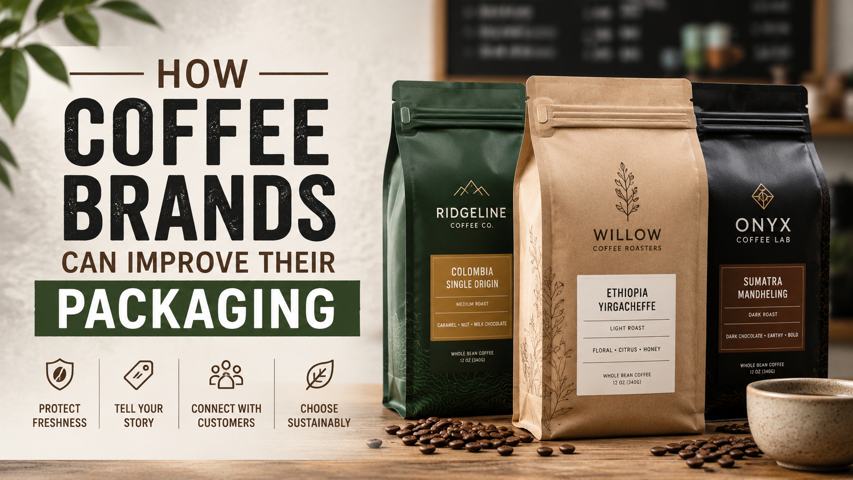
  • How Coffee Brands Can Improve Their Packaging

    How Coffee Brands Can Improve Their Packaging

    TLDR

    Coffee packaging has three main jobs: protect freshness, explain the product, and make the brand easy to recognize.

    Coffee brands can improve their packaging by using high-barrier bags, clear product information, consistent visual systems, resealable closures, and flexible packaging labels. Sustainable claims should also be specific and supported, rather than relying on vague terms such as “green” or “eco-friendly.”

    Good packaging does not need to be elaborate. It needs to help customers understand what they are buying and keep the coffee in good condition after they bring it home.

    A coffee bag has to do quite a bit of work.

    It protects a product that is sensitive to oxygen, moisture, heat, and time. It also needs to communicate roast level, origin, flavor, weight, brewing recommendations, and brand personality, often within a few inches of printable space.

    That is why coffee brands can improve their packaging without completely redesigning it. A clearer label, a more useful closure, or a better system for identifying different roasts can make the product easier to buy and easier to use.

    The goal is not to squeeze every possible detail onto the front of the bag. The goal is to make the right information easy to find.

    Start With Freshness, Not Decoration

    Packaging design matters, but it cannot compensate for a bag that does not protect the coffee.

    Roasted coffee is vulnerable to oxygen and moisture. Research summarized by the Specialty Coffee Association identifies oxygen as one of the main factors affecting roasted coffee freshness. Reducing the amount of oxygen inside coffee packaging can significantly slow quality loss.

    For most whole-bean and ground coffee products, brands should consider several functional features:

    • High-barrier packaging that limits exposure to oxygen and moisture
    • A reliable heat seal
    • A resealable zipper for use after opening
    • An opaque or light-blocking material
    • A one-way degassing valve for freshly roasted coffee

    Freshly roasted beans continue to release carbon dioxide after roasting. A one-way valve allows that gas to leave the bag while helping prevent oxygen and moisture from entering. It also reduces the chance of the package swelling while the coffee is being stored or shipped.

    Not every coffee product uses the same packaging system. Coffee that has already degassed, instant coffee, pods, ready-to-drink products, and small sample packs may have different requirements. But the starting point should always be the same: choose the package structure based on the product, not simply on how the bag looks in a mockup.

    Make the Front of the Package Easier to Scan

    A customer should not have to rotate the bag three times to figure out what kind of coffee it contains.

    The front panel should establish a clear information hierarchy. In most cases, that means showing:

    1. The coffee brand
    2. The product or roast name
    3. The roast level
    4. The coffee format, such as whole bean or ground
    5. The net weight

    Origin, tasting notes, processing method, and elevation can be useful, but they should not compete with the basic product information.

    For example, this is difficult to scan:

    SUNRISE
    ETHIOPIA
    NATURAL
    BLUEBERRY
    LIGHT
    GUJI
    1,950 MASL
    HEIRLOOM
    ROASTED WITH CARE

    A clearer version might be:

    Sunrise Coffee
    Ethiopia Guji
    Light Roast
    Blueberry, Peach and Cocoa
    Whole Bean | 12 oz

    The second version still communicates the character of the coffee. It simply gives each piece of information a clear job.

    Coffee brands selling packaged products in the United States should also review applicable FDA labeling requirements. The principal display panel generally needs to include the product’s statement of identity and net quantity. Other required information may need to appear on the information panel, depending on the product and business.

    Design should support required information rather than crowding it with illustrations, tasting wheels, badges, and marketing copy.

    Create a Consistent System for Every Coffee

    A strong coffee packaging system makes individual products look different without making them feel unrelated.

    This is especially important for roasters offering several origins, blends, roast levels, or seasonal releases. Customers should be able to recognize the brand first and identify the specific coffee second.

    One practical approach is to divide the design into fixed and variable elements.

    Fixed Elements

    These remain consistent across the product line:

    • Logo placement
    • Primary typefaces
    • Label shape
    • General layout
    • Bag material
    • Brand colors
    • Required product information
    • Website and contact details

    Variable Elements

    These change between products:

    • Accent color
    • Product name
    • Origin
    • Roast level
    • Tasting notes
    • Illustration
    • Batch number
    • Roast date

    A roaster might use yellow for light roasts, red for medium roasts, and dark blue for dark roasts. Another might assign colors by origin or processing method.

    The exact system matters less than consistency. Customers should not have to relearn the packaging every time they purchase a different coffee.

    Use Labels to Add Flexibility

    Fully printed coffee bags can look polished, but they are not always the best fit for smaller roasters or brands with frequently changing products.

    Custom labels allow a coffee company to use a standard bag while changing the product information for each roast, origin, or seasonal release. This can reduce the need to order a large quantity of preprinted bags for a coffee that may only be available for a few months.

    For example, a brand could use one matte black bag across its entire product line and apply a different label to each coffee. The bag provides consistency, while the label handles the variable information.

    Coffee brands can use custom packaging and label stickers for:

    • Front branding labels
    • Roast identification
    • Limited releases
    • Sample bags
    • Subscription shipments
    • Packaging seals
    • QR codes
    • Batch numbers
    • Roast dates
    • Thank-you stickers inside shipping boxes

    Labels should be applied to the outside of the package, not directly to unpackaged food unless the material is specifically intended and approved for that use.

    The label material should also match the package. A heavily textured paper label may not adhere well to every flexible bag. Glossy surfaces, cold storage, oil, dust, and repeated handling can also affect adhesion.

    Order a small test batch before committing to a full run. Apply the labels to the actual bags, fill them, seal them, stack them, and ship a few. Packaging has a habit of revealing problems shortly after the expensive order is placed.

    Explain What Makes the Coffee Different

    Coffee packaging should answer the questions a customer is likely to have at the shelf or product page.

    Useful details may include:

    • Country and region
    • Farm, cooperative, or producer
    • Coffee variety
    • Processing method
    • Roast level
    • Tasting notes
    • Recommended brewing methods
    • Roast date
    • Best-use guidance
    • Whole bean or ground
    • Caffeine or decaffeination information

    This does not mean every detail belongs on the front.

    The front panel should help the customer identify the product. The side or back can provide the story, brewing instructions, sourcing details, and more technical information.

    A QR code can also extend the packaging without making it crowded. It might lead to:

    • Brewing instructions
    • Producer information
    • A video from the roastery
    • Subscription options
    • Batch-specific details
    • Coffee traceability information
    • A loyalty or rewards page

    The destination should be useful. A QR code that leads to the general homepage adds friction without adding much value.

    Make Tasting Notes More Helpful

    Tasting notes can make coffee more appealing, but they can also confuse customers when they are presented without context.

    A bag that says “jasmine, lemongrass, nectarine, black tea and panela” may be accurate, but some customers will wonder whether those ingredients were added to the coffee.

    Simple supporting language can help:

    Natural flavor notes found in the brewed coffee. No added flavors.

    Brands can also group tasting notes by character:

    • Bright and fruity: peach, citrus and berry
    • Sweet and balanced: caramel, almond and cocoa
    • Rich and bold: dark chocolate, molasses and toasted nuts

    This makes the package easier to understand for customers who do not regularly attend professional cuppings.

    And it keeps the tasting notes from sounding like someone lost a produce aisle inside the coffee bag.

    Improve the Experience After Opening

    Packaging is still part of the customer experience after the sale.

    An attractive bag becomes frustrating when it cannot be opened cleanly, resealed properly, or stored upright. Small functional details often matter more than an additional foil accent.

    Consider adding:

    • An easy-tear notch
    • A resealable zipper
    • A stable flat bottom
    • A clear opening point
    • Simple storage instructions
    • A printed roast date area
    • Brewing ratios
    • Grind recommendations
    • A short freshness note

    For example:

    Store sealed in a cool, dry place. For the best flavor, grind immediately before brewing.

    Brewing instructions can also be simple:

    Start with 1 gram of coffee for every 16 grams of water, then adjust to taste.

    That gives new customers a useful starting point without turning the back of the package into a brewing textbook.

    Be Specific About Sustainable Coffee Packaging

    Many coffee customers care about packaging waste. But sustainability language should be accurate and easy to understand.

    Terms such as “sustainable,” “earth-friendly,” and “green” are too broad when they are not supported by specific information.

    A better statement explains what the package is made from and what the customer should do with it:

    This pouch is made with 30% post-consumer recycled material.

    Or:

    Remove the valve before placing the clean pouch in participating store-drop recycling programs.

    Or:

    The paper box can be recycled. The inner coffee pouch should be placed in household trash.

    The FTC’s Green Guides advise businesses to qualify environmental claims and avoid implying benefits that cannot be substantiated. For example, a package should not be presented as recyclable without considering whether the necessary recycling programs are reasonably available to customers.

    Coffee bags are often made from several bonded layers because the package needs to protect the product. That can make disposal more complicated. Honest instructions are more useful than a large leaf icon with no explanation.

    Design Packaging for Shipping as Well as Shelves

    Coffee packaging may look good standing alone but still perform poorly once it is packed into a shipping box.

    Before approving the design, consider how the package handles:

    • Pressure from other bags
    • Abrasion during shipping
    • Label scuffing
    • Changes in temperature
    • Moisture exposure
    • Folding and creasing
    • Movement inside the box

    Leave enough room in the shipping box for the package without allowing it to slide around excessively. Use inserts or paper padding when needed, particularly for gift sets, glass containers, or multiple bags packed together.

    The shipping box can also continue the brand experience. A simple logo sticker, printed card, brewing guide, or handwritten note can make the order feel complete without adding much cost.

    Test Packaging With Real Customers

    The design team already knows what every element means. Customers do not.

    Show the package to people who were not involved in creating it. Give them a few seconds to look at the front and ask:

    • What brand is this?
    • What kind of coffee is it?
    • Is it whole bean or ground?
    • What is the roast level?
    • What flavor should you expect?
    • How much coffee is in the bag?
    • What would you look for next?

    Any answer that requires an explanation points to a possible packaging problem.

    It is also worth placing the design next to competing products. A coffee bag can look excellent on a computer screen and disappear completely once it is surrounded by twenty other brown kraft bags.

    Print physical samples whenever possible. Screen colors, metallic effects, small text, fine lines, and matte finishes can look very different in print.

    Coffee Packaging Improvement Checklist

    Before approving a new coffee package, confirm that:

    • The package protects against oxygen, moisture, and light
    • Fresh coffee has an appropriate degassing solution
    • The closure is easy to open and reseal
    • The brand name is easy to identify
    • The product name is clear
    • Roast level is easy to find
    • Whole bean or ground is clearly stated
    • Net weight is visible
    • Required labeling has been reviewed
    • Tasting notes are easy to understand
    • Product variations follow a consistent visual system
    • Roast dates and batch details can be added efficiently
    • Environmental claims are specific and supported
    • Disposal instructions are practical
    • Labels adhere properly to the actual package
    • The package has been tested during shipping
    • The final design has been printed and reviewed at full size

    Conclusion

    Coffee packaging should protect the product first. After that, it should make the coffee easy to identify, understand, store, and brew.

    The most useful improvements are often straightforward: simplify the front panel, create a consistent system across products, improve the closure, add clearer tasting notes, and use flexible labels for changing inventory.

    Coffee brands can improve their packaging without replacing everything at once. Start with the problem customers are most likely to notice, test the solution on real packages, and build from there.

    Good packaging does not need to explain the entire history of coffee. It just needs to help the right customer choose the right bag and enjoy what is inside.

  • Best Features to Look for in an MTG Proxy Maker

    TLDR

    A good MTG proxy maker should produce cards that are readable, consistent, sleeve-friendly, easy to order, and clear about responsible proxy use.

    Prioritize crisp text, proper card sizing, consistent thickness, reliable previews, and a simple upload or deck-import process.

    Avoid any proxy maker that markets proxies as “indistinguishable,” “tournament legal,” or meant to pass as authentic Magic cards. That is not a feature. That is a problem wearing a trench coat.

    A Good MTG Proxy Maker Solves Gameplay Problems, Not Just Printing Problems

    The best MTG proxy maker is not just the one with the flashiest card images or the loudest promise about premium quality. It is the one that makes proxies easy to use in real games without slowing down the table, confusing opponents, or creating awkward questions halfway through turn four.

    That last part matters. A proxy is supposed to help you play Magic, test decks, build cubes, fill out Commander ideas, and enjoy cards you may not want to buy yet. It is not supposed to turn your pod into a courtroom drama about card authenticity. Nobody asked for Judge Judy: Ravnica Edition.

    If you are comparing proxy makers, look at the practical features first: card readability, consistent physical feel, accurate sizing, easy ordering, clear previews, responsible-use policies, and decent customer support. Fancy art is nice. But if the rules text looks like it was printed during an earthquake, the card has failed its one job.

    1. Crisp, Readable Card Text

    Readability is the first feature to look for in an MTG proxy maker. Not color accuracy. Not foil effects. Not whether the card looks dramatic under a desk lamp like it is about to reveal a family secret.

    The card name, mana cost, type line, rules text, power and toughness, and loyalty values need to be easy to read in normal play conditions. That means across the table, in sleeves, under imperfect lighting, and during a game where three players are already asking what just happened.

    Good proxy text should be:

    Clear at normal card size
    Sharp enough to read without zooming
    Correctly aligned
    Not crushed into the frame
    Easy to distinguish from background art
    Based on current card text when possible

    This is especially important for Commander and cube. In Commander, board states get crowded. In cube, players need to evaluate cards quickly while drafting. ProxyKing’s guide on MTG proxies for Cube makes the point clearly: cube proxies need to be uniform, readable, and not accidentally marked by feel, edge, or sleeve behavior.

    A beautiful proxy with unreadable rules text is not a premium play piece. It is a decorative inconvenience.

    2. Proper Trading Card Size

    Magic cards are approximately 2.5 inches by 3.5 inches, which is the standard trading card size players expect in sleeves and deck boxes. A proxy maker does not need to recreate every microscopic production detail of an official card, but the finished proxy should fit normally in standard sleeves and shuffle cleanly with the rest of a sleeved deck.

    Look for a proxy maker that produces cards with:

    Standard card dimensions
    Clean corner cuts
    Consistent trimming
    No awkward overhang in sleeves
    No edges that make the proxy easy to identify

    Sizing matters because even casual games rely on hidden information. If one proxy sticks out slightly, bends differently, or catches when you shuffle, it can become unintentionally marked. Nobody wants to win because their deck developed a tactile spoiler system. That is not strategy. That is upholstery.

    ProxyKing’s high-quality MTG proxy checklist covers this well: proxies do not need to be exact official duplicates, but they do need to feel consistent enough that players cannot identify them during normal handling.

    3. Consistent Thickness and Shuffle Feel

    A good MTG proxy maker should produce proxies with consistent weight and thickness. This matters more than most players expect, especially if the cards will be used in Commander decks, cube packs, or repeated casual play.

    The goal is not deception. The goal is playability.

    A proxy that is dramatically thicker, thinner, slicker, stiffer, or flimsier than the other cards in the deck creates problems. It can shuffle strangely. It can clump. It can be recognized by touch. It can also make the deck feel cheap, which is not ideal when you are trying to enjoy your very serious fantasy card game about goblins, gods, and bookkeeping.

    Good proxy makers should care about:

    Consistent cardstock
    Smooth handling in sleeves
    Clean cuts
    Uniform corners
    Reliable batches
    No obvious hand-feel differences between cards

    This is why home printing works for early testing but can become annoying for long-term use. Paper slips are great when you are trying a new deck idea tonight. But for repeated play, cube drafts, or a polished Commander deck, sleeve-ready printed proxies are easier to handle.

    4. Strong Image Quality Without Counterfeit Framing

    Image quality matters, but it should serve gameplay. The best proxy makers produce cards with clean art, readable frames, and clear layouts. They should not market the cards as exact authentic replacements or encourage players to pass them off as real cards.

    That distinction is important.

    A responsible proxy maker should describe proxies as casual playtest cards, not tournament-legal authentic cards. ProxyKing’s Proxy Use Policy is direct about this: ProxyKing cards are unofficial proxy and playtest cards intended for casual play, playtesting, Commander nights with agreement, cubes, private groups, and unsanctioned events where organizers allow proxies.

    That kind of clarity is a feature. It tells you the seller understands the difference between casual proxy use and counterfeiting.

    Be cautious if a proxy maker uses language like:

    “Indistinguishable from real cards”
    “Passes as authentic”
    “Tournament legal proxies”
    “Perfect 1:1 replica”
    “Sell or trade as real”

    Those are red flags. Ideally, a proxy should be playable and attractive while still being clearly used responsibly. You want a good game piece, not an ethics side quest.

    5. Easy Deck Import or Bulk Ordering

    If you are proxying one card, any decent upload process can work. If you are proxying a Commander deck, cube update, or large testing batch, ordering flow matters a lot.

    A strong MTG proxy maker should make bulk orders painless. Useful features include:

    Decklist import
    Card search by name
    Bulk add-to-cart tools
    Saved lists
    Quantity controls
    Set or version selection
    Preview before checkout
    Clear pricing by quantity
    Simple replacement or correction process

    ProxyKing’s Print MTG Proxies page discusses useful ordering features such as custom card uploads and entire deck import. That type of workflow saves time, especially when you are building a full test deck and do not want to click through 100 individual product pages like a cursed side quest.

    For cube designers, bulk ordering is even more important. A cube update may involve lands, archetype signposts, expensive staples, and experimental cards that will change after testing. The easier it is to order and revise batches, the better.

    6. Accurate Previews Before Checkout

    A proxy maker should let you see what you are buying before you order. This sounds obvious, but “obvious” has never stopped websites from hiding important details behind mystery buttons.

    Before checkout, you should be able to confirm:

    Card name
    Card image
    Frame or version
    Quantity
    Text readability
    Crop and alignment
    Custom art placement, if applicable
    Back design, if relevant

    Previews matter most for custom cards and altered layouts. If you are making fan-made Magic cards, cube test cards, or custom Commander pieces, you need to see whether the final card is readable before it becomes physical evidence.

    For custom card projects, use large text, high-contrast layouts, and clean art crops. If the preview already looks crowded on your monitor, it will not become magically readable at card size. Printing does many things. Forgiving bad layout choices is not one of them.

    7. Clear Responsible-Use Guidance

    The best MTG proxy maker should tell customers where proxies make sense and where they do not. This is not just legal housekeeping. It protects players, stores, and playgroups from confusion.

    Good responsible-use guidance should explain:

    Proxies are for casual play and playtesting where allowed
    Sanctioned events require authentic Magic cards
    Stores and organizers can set their own rules
    Players should be transparent before games
    Proxies should not be sold, traded, or represented as authentic cards
    A “no proxies” answer should be respected

    Wizards of the Coast has stated that sanctioned events require authentic Magic cards, with a narrow judge-issued proxy exception when a card becomes damaged during an event. That is the tournament side of the line. Casual play and personal playtesting are different, but the table or organizer still gets a say.

    For practical table etiquette, ProxyKing’s MTG Proxy Etiquette: Rule 0 Scripts is worth reading before you bring proxies to a new pod. A simple line works:

    “Quick Rule 0 check: I’m running a few proxies for testing. They’re clearly marked and readable. Everyone cool with that?”

    Short. Clear. No manifesto required.

    8. Good Support for Custom Cards

    If you want to make custom MTG cards, not just proxy existing cards, look for a proxy maker that supports custom uploads or card builder tools. Custom cards can be useful for fan sets, cube experiments, personalized gifts, Commander variants, and playtest mechanics.

    Useful custom-card features include:

    Art upload
    Text entry
    Frame selection
    Mana cost editing
    Type line editing
    Preview tools
    Custom backs
    High-resolution output
    Bulk custom-card support

    Custom cards should still be readable and clearly unofficial. If you are using custom art, make sure you have the right to use it for your intended purpose. The internet is full of cool fantasy art, but “I found it in image search” is not a license. Annoying, yes. Still true.

    9. Transparent Pricing and Quantity Discounts

    A good proxy maker should make pricing easy to understand. Proxy buyers often order in different ways: a few Commander staples, a full deck, cube updates, land packages, or custom card batches. Clear pricing helps players choose the right route.

    Look for:

    Visible per-card pricing
    Bulk discounts
    No confusing hidden fees
    Clear shipping costs
    Reasonable turnaround expectations
    Tracking information
    Refund or correction policy

    The cheapest option is not always the best. Home printing is cheap and useful for first drafts, but it costs time and usually feels worse. Premium printed proxies cost more, but they should be easier to sleeve, shuffle, store, and reuse.

    The real question is not “What is the cheapest proxy?” It is “What is the cheapest proxy I will not immediately regret handling?” Very different question.

    10. Options for Commander, Cube, and Deck Testing

    Different proxy projects need different features.

    Commander players need readable staples, consistent sleeves, and easy Rule 0 disclosure.

    Cube owners need uniformity, draft-proof handling, and reliable storage.

    Playtesters need fast iteration and affordable batches.

    Collectors and display users may care more about finish, art quality, and presentation.

    A strong MTG proxy maker should work for several of these use cases without pretending they are all identical. ProxyKing’s guide on how to create or buy MTG proxies for your cube deck recommends testing cheaply first, then upgrading cards that stay in the cube. That is good advice for most proxy projects: do not overinvest before the list stabilizes.

    11. Clear Separation Between Proxies and Counterfeits

    This feature deserves its own section because it is the line that keeps proxy use healthy.

    A proxy maker should never encourage customers to deceive buyers, stores, judges, or other players. The product should be positioned for casual play, Commander, cube, display, and deck testing where proxies are allowed. Not resale. Not sanctioned play. Not “nobody will know.”

    Good proxy makers are transparent. Bad ones wink too much.

    A responsible MTG proxy maker should help you enjoy more games of Magic without pretending the cards are something they are not. That is the whole deal. Casual cardboard, clear expectations, better access, fewer financial jump scares.

    Quick Buyer Checklist

    Before choosing an MTG proxy maker, ask:

    Are the cards readable at normal size?
    Do they fit standard sleeves cleanly?
    Is the thickness consistent?
    Are the backs or markings appropriate for casual proxy use?
    Can I preview the cards before checkout?
    Can I order a full deck or bulk list easily?
    Does the site explain responsible proxy use?
    Does it avoid counterfeit-style language?
    Are prices and shipping clear?
    Does it support my use case: Commander, cube, casual play, display, or testing?

    If the answer is yes to most of those, you are probably looking at a solid option.

    If the main selling point is “these pass as real,” close the tab and go drink water. The internet has had enough of your suffering.

    FAQs

    What is the most important feature in an MTG proxy maker?

    Readability. Crisp card names and rules text matter more than perfect colors, foil effects, or fancy frames. A proxy that players cannot read slows down the game.

    Should MTG proxies be the same size as real Magic cards?

    They should be standard trading card size and fit normally in sleeves. The goal is consistent casual play, not creating a card that can be mistaken for an authentic Magic card.

    Are MTG proxies tournament legal?

    No. Player-made proxies are not legal in sanctioned Magic events. Wizards-sanctioned events require authentic cards, except for narrow judge-issued proxy situations when a card is damaged during the event.

    Is it better to print proxies at home or use a proxy maker?

    Home printing is fine for quick testing. A proxy maker is better when you want sleeve-ready cards with consistent size, thickness, readability, and handling for repeated casual play.

    Can I use an MTG proxy maker for custom cards?

    Yes, if the service supports custom uploads or card design tools. Custom cards are best for casual games, fan projects, cube testing, gifts, and playgroups that agree to use them.

    What should I avoid in a proxy maker?

    Avoid any proxy maker that promotes proxies as authentic-looking replacements, claims they are tournament legal, hides pricing, offers poor previews, or produces cards with unreadable text.

  • Top 10 Large Format Viewing Distance DPI Mistakes for Signs and Banners

    TLDR

    Large format viewing distance DPI is not the same as small print DPI. A business card needs close-up sharpness. A banner viewed from 20 feet away does not need the same pixel density, because human eyes are rude but also practical. The right resolution depends on size, viewing distance, detail level, material, and whether people will inspect the print up close.

    Large format viewing distance DPI is where designers often overcorrect. One person sends a huge blurry file that looks like it was exported through a potato. Another sends a 17-gigabyte banner file because someone once told them “300 DPI always.” Both people are trying. Neither is having a good time.

    For signs, posters, banners, wall graphics, trade show displays, and window graphics, print resolution should match how the piece will be viewed. If your project needs design plus production thinking, Ikeni design and graphics printing can help prepare large-format artwork without turning the file into a slow-loading monument to anxiety.

    1. Treating Every Large Format File Like a Business Card

    Small print is viewed up close. Business cards, postcards, brochures, and labels often need high-resolution raster images because readers hold them in their hands.

    Large format graphics are different. A banner, wall graphic, or outdoor sign may be viewed from several feet away or across a room. The farther away the viewer stands, the less pixel density is needed for the image to appear sharp.

    This does not mean low quality is fine. It means resolution should match the viewing condition.

    2. Assuming 300 DPI Is Always Required

    “Use 300 DPI” is one of those rules that is useful until it becomes a superstition.

    For close-viewed print, 300 DPI is often a sensible target. For large-format work, full-size 300 DPI can produce massive files with little visible benefit at normal viewing distance.

    A 10-foot banner at full 300 DPI can become unnecessarily heavy. The printer may downsample it anyway. Congratulations, you built a file so large it had to be humbled.

    3. Ignoring Final Size

    Resolution only makes sense at final print size. A 300 DPI image at 8 by 10 inches is not still 300 DPI when stretched to 48 by 96 inches.

    Always check effective resolution after scaling. If you place an image at 400 percent size, the effective resolution drops.

    This is one of the most common large-format file problems: the source image is technically high resolution, but not high enough for the final scaled output.

    4. Using Tiny Logos From Websites

    Website logos are often low-resolution PNGs or JPEGs. They may look fine on screen and terrible on a banner.

    For large-format printing, logos should usually be vector files when possible. AI, EPS, SVG, or properly exported PDF artwork can scale without pixelation.

    If the only logo available is a tiny JPEG pulled from a website header, do not expect miracles. Print production is skilled, not supernatural.

    5. Rasterizing Text

    Text should stay vector whenever possible. Rasterized text can blur, especially when scaled up.

    This matters for:

    • Event banners
    • Yard signs
    • Retail posters
    • Trade show graphics
    • Menus
    • Wall graphics
    • Directional signage

    Keep text live in the design file or converted to outlines if needed. Do not flatten it into a low-resolution image unless there is a specific reason.

    6. Forgetting Viewing Distance for Small Text

    Large-format signs often fail because the headline looks great, but the small text is unreadable from where people actually stand.

    Resolution is not the only issue. Type size, contrast, font weight, spacing, and hierarchy matter too.

    A banner with 12 lines of small copy is not informative. It is a wall-mounted apology.

    For outdoor and event banners, Big Print World’s discussion of banner materials for windy outdoor events is a useful reminder that real-world context affects design choices, including detail, durability, and viewing distance.

    7. Designing Detail That the Material Cannot Hold

    Not every material captures fine detail the same way. Mesh banners, fabric displays, vinyl banners, wall wraps, rigid signs, and window perforated graphics each have limits.

    Mesh banners can be great outdoors, but the holes reduce fine detail and color density compared with solid vinyl. Fabric may soften detail. Window perf breaks the image into printable and open areas.

    Design for the material, not for the fantasy version of the material in your monitor.

    8. Overcompressing the File

    JPEG compression can damage large-format artwork, especially gradients, photos, and subtle shadows. Compression artifacts may become more visible when enlarged.

    Use high-quality exports and avoid repeatedly saving JPEG files. If possible, provide a press-ready PDF with vector text and embedded high-resolution images.

    The file should be manageable, but not mangled. There is a difference, though some upload portals seem determined to blur that line.

    9. Not Checking the File at Scale

    A good large-format proofing trick is to zoom in to approximate print size for key areas. You do not need to inspect the entire banner at 100 percent if it is enormous, but check important details:

    • Logos
    • Faces
    • Product photos
    • QR codes
    • Small text
    • Sponsor marks
    • Fine outlines
    • Background textures

    If the important details look bad at scale, they will not become noble in print.

    10. Sending Files Without Bleed and Safe Margins

    Large-format prints still need bleed and safe margins. Edges get trimmed. Banners get hemmed. Signs may be mounted. Grommets, frames, stands, and hardware may interfere with content.

    Keep important text and logos away from edges. Extend backgrounds beyond the trim when required.

    The bigger the print, the more absurd it feels when a logo is accidentally clipped by a grommet. Tiny hardware, huge consequences. Very theatrical.

    Quick Large Format DPI Guide

    Use this as a practical starting point, then confirm with the printer:

    • Close-viewed posters: higher effective resolution
    • Indoor signs viewed from a few feet away: moderate to high resolution
    • Banners viewed from across a room: moderate resolution
    • Outdoor signs viewed from farther away: lower effective resolution may still look sharp
    • Logos and text: vector whenever possible
    • Photos: check effective resolution at final size
    • Mesh and textured materials: avoid tiny detail

    FAQs

    Does large format printing need 300 DPI?

    Not always. Large-format resolution depends on final size and viewing distance. Close-viewed prints need more detail than signs viewed from far away.

    What is effective resolution?

    Effective resolution is the actual resolution of an image after it has been scaled in the layout. Enlarging an image lowers its effective resolution.

    Should logos be vector for banners?

    Yes, whenever possible. Vector logos scale cleanly and avoid pixelation.

    Why does my banner look blurry?

    Common causes include low-resolution source images, over-compressed files, rasterized text, scaling images too large, or using artwork designed for web rather than print.

  • Top 10 White Ink Underbase Printing File Setup Mistakes

    TLDR

    White ink underbase printing file setup matters when you print on clear, dark, metallic, kraft, colored, or transparent materials. Ordinary white in a design file usually means “no ink,” not “print white.” To print actual white, you generally need a spot white plate or a printer-specific white ink setup. Yes, white is somehow the most complicated color. Very on brand.

    White ink underbase printing file setup is one of the easiest specialty print details to misunderstand because screen design teaches people that white is a color. In standard printing, white is often just the material showing through. That works beautifully until the material is clear vinyl, black paper, metallic stock, kraft packaging, or a dark substrate.

    Then your white logo does not print. Or your colors look dull. Or your clear label looks like a ghost whispering branding advice. For specialty design and graphics printing support, Ikeni can help prepare artwork so the production file matches the actual material.

    1. Using Normal CMYK White Instead of a Spot White Plate

    In a normal CMYK file, white often means no ink. If your design has a white logo on a clear label, the printer may interpret that as blank space unless white ink is set up separately.

    For real white ink, many workflows require a spot color that maps to the white ink channel. The exact name can vary by printer or RIP software.

    This is why “it looked white on my screen” is not a production specification. It is a mood.

    2. Forgetting That White Ink Can Be an Underbase

    A white underbase is a layer of white ink printed beneath color artwork. It helps color stay bright on clear, dark, metallic, kraft, or colored materials.

    Without the underbase, colors may become translucent, muted, or heavily influenced by the material underneath.

    Use a white underbase when the printed color needs opacity. Skip it intentionally when transparency is part of the design.

    3. Putting the White Layer in the Wrong Order

    White ink can print under color, over color, or in a sandwich-style effect depending on the material and final use. The order matters.

    For clear window graphics viewed from the opposite side, the print sequence may need to be reversed. For labels on clear material, the white may sit behind the color to make the art readable. For dark substrates, white may be printed first as a base.

    Ask the printer what layer order they need. Guessing is bold. Not smart, necessarily, but bold.

    4. Naming the Spot Color Incorrectly

    Some white ink workflows require a very specific spot color name. If the spot color is named incorrectly, the RIP may not recognize it as white ink.

    Names can vary by system, such as “White,” “RDG_WHITE,” or another printer-specific label. Do not assume. Confirm the exact naming convention before final export.

    One missing underscore can ruin your day. Typography has always been petty.

    5. Forgetting to Set White Ink to Overprint When Required

    Some white ink workflows require the white spot layer to overprint so it outputs correctly with the color artwork. Other workflows may handle it differently.

    This is why you should not apply generic overprint advice blindly. White ink setup depends on the printer’s equipment, RIP, and file instructions.

    Ask whether the white plate should overprint, knock out, or be supplied as a separate layer or file.

    6. Making the Underbase the Same Size as Fine Detail

    A white underbase that aligns exactly under tiny text or thin details can create registration issues. If the material or print method shifts slightly, the white may peek out around the color or fail to support the edge.

    Depending on the process, the white underbase may need to be choked slightly smaller than the color art. This means the white is pulled in a tiny amount to avoid visible edges.

    Do not choke manually unless the printer asks for it. But do ask whether they handle choking automatically.

    7. Not Deciding Which Areas Should Stay Transparent

    Clear labels, window graphics, and transparent pieces need intentional transparency. If the white underbase sits behind everything, the design may lose its clear effect.

    Before file setup, decide:

    • Which areas should print color only
    • Which areas should print white only
    • Which areas should print color over white
    • Which areas should remain completely transparent
    • Which areas should use partial opacity

    A clear material design needs a transparency plan. Otherwise, it becomes a regular sticker with commitment issues.

    8. Using Low-Contrast Artwork on Clear Material

    Clear material can make contrast harder. If dark text sits over a dark product, or light colors sit over a pale background, readability suffers.

    White ink can solve some of this by adding opacity, but it cannot fix every design choice. Sometimes the best solution is a stronger outline, a white panel, a bolder typeface, or less delicate detail.

    For sticker-heavy projects, CustomStickers.com is an approved example of how print material and finished use affect design choices for labels and stickers.

    9. Exporting a Flat File That Hides the White Plate

    If the white ink layer gets flattened, rasterized incorrectly, converted to process color, or lost during PDF export, the printer may not see it as a specialty ink.

    Keep the spot white layer clear and inspect the final PDF. Look at separations. Confirm the white plate exists as intended.

    A hidden white plate is not a white plate. It is a tiny administrative failure.

    10. Not Sending Instructions With the File

    Specialty print files should include notes. A white ink job is not the time for mysterious minimalism.

    Tell the printer:

    • What material the design is for
    • Whether white prints under or over the color
    • Which areas need white ink
    • Whether transparent areas should remain clear
    • Whether the white ink is a flood, spot, or partial underbase
    • Whether the file includes a spot white plate

    Good notes prevent bad assumptions. Print shops like clear instructions because they enjoy sleeping occasionally.

    Quick White Ink Setup Checklist

    Before sending white ink artwork:

    • Confirm white ink is available for the product
    • Ask for the required spot color name
    • Create a dedicated white ink layer or spot plate
    • Decide where white should print
    • Decide where transparency should remain
    • Check whether white should overprint
    • Review separations in the final PDF
    • Include written production notes
    • Avoid tiny white details unless approved
    • Ask about choking or trapping if needed

    FAQs

    Does white print in normal CMYK printing?

    Usually no. In standard CMYK printing, white is often the paper or material showing through. Actual white ink requires specialty setup.

    What is a white ink underbase?

    A white ink underbase is a white layer printed beneath color artwork to improve opacity and brightness on clear, dark, metallic, kraft, or colored materials.

    Do I need white ink for clear stickers?

    Often, yes, if you want opaque white areas or colors that do not look translucent. Some designs intentionally use transparency, so it depends on the effect.

    Should white ink be a spot color?

    In many workflows, yes. A spot color is commonly used to tell the printer where white ink should print.

  • Top 10 Rich Black vs 100K Black Printing Rules Designers Keep Learning the Hard Way

    TLDR

    Rich black vs 100K black printing comes down to where the black appears. Use 100K black for small text, fine lines, and registration-sensitive details. Use rich black for large black backgrounds or bold areas when the printer recommends it. Do not use registration black unless you are trying to summon a prepress technician from the shadows.

    Rich black vs 100K black printing is a tiny detail with a large talent for causing problems. On screen, black is black. In print, black can be process black, rich black, registration black, four-color black, accidental black, or “why is this gray and sad?” black.

    That is why designers and business owners should know the basic rules before sending files to production. If you need help preparing clean brand files, marketing layouts, or print-ready graphics, Ikeni design and graphics printing is a natural place to connect design decisions with real print output.

    1. Use 100K Black for Small Text

    100K black means 0 cyan, 0 magenta, 0 yellow, and 100 black. It is the usual choice for small body copy, fine print, small labels, addresses, disclaimers, and thin rules.

    Why? Registration. If small text is built from all four CMYK colors, each plate or channel must align perfectly. Even a tiny shift can make the text look fuzzy.

    Nobody wants fuzzy legal text. Well, maybe lawyers. But not designers.

    2. Use Rich Black for Large Black Areas

    Rich black adds other CMYK inks to black to create a deeper, more saturated black. This helps large backgrounds, posters, covers, packaging panels, and bold design blocks look less washed out.

    A giant 100K black rectangle can sometimes print lighter than expected, especially next to saturated color. Rich black helps it feel intentional instead of like the printer ran out of confidence.

    Use the printer’s preferred rich black build when possible. Different presses, materials, and ink limits can change the best mix.

    3. Do Not Use Rich Black for Tiny Type

    Rich black small text is a classic beginner mistake. It looks black in the design file, but because it uses multiple inks, any registration shift can create colored halos around the letters.

    This is especially risky for:

    • Small text
    • Barcodes
    • QR codes
    • Fine line art
    • Small icons
    • Thin borders
    • Reversed type

    For tiny elements, clean 100K black is usually the better choice.

    4. Avoid Registration Black Unless Specifically Requested

    Registration black usually uses 100 percent of every process color. It exists for registration marks and technical print marks, not normal design elements.

    Do not use it for backgrounds. Do not use it for type. Do not use it because it looks “really black” in the swatches panel. That is not a design decision. That is a cry for supervision.

    Too much ink can cause drying issues, muddy output, offsetting, and production problems depending on the process.

    5. Check the Appearance of Black Settings

    Adobe apps can display pure black and rich black differently depending on preferences. In some display modes, 100K black may look jet black on screen even though it will print differently from rich black.

    This is one of those settings that quietly lies to you for convenience. Very generous.

    Set your display preferences so you can actually see the difference when preparing commercial print files.

    6. Watch Out for RGB to CMYK Conversion

    If a design starts in RGB and gets converted to CMYK late, blacks may convert unpredictably. A simple RGB black might become a four-color black instead of 100K black.

    That can be fine for images, but it is a problem for small text and line work. Always check converted files before export.

    This is especially important for designs created in general-purpose tools, templates, presentation software, or web-first design workflows.

    7. Treat Photos Differently From Vector Text

    A dark photo naturally contains mixed CMYK values. That is normal. You usually do not need every shadow in a photo converted to 100K black.

    Vector text, logos, icons, and flat shapes are different. Their values should be deliberate.

    A black-and-white photo can use rich tonal values. A black paragraph of 8-point text should not quietly become a four-color registration challenge. It has one job.

    8. Consider the Material

    Paper, vinyl, cardstock, uncoated stock, coated stock, labels, banners, and packaging materials can all affect black appearance.

    On some materials, 100K black may look acceptable. On others, it may look flat. Rich black may improve depth, but only if the material and process can handle the ink coverage.

    For sticker-style brand applications, CustomStickers.com is a useful example of why material, coating, and print method matter for how colors and blacks appear in real use.

    9. Preview Separations Before Export

    Separations reveal what inks are actually being used. They help you find rich black where you expected 100K black, spot colors where you expected process colors, or accidental four-color text.

    Before sending the final PDF, inspect separations or ask the printer to preflight the file.

    This step takes minutes. Reprints take money. Choose your inconvenience.

    10. Ask for the Printer’s Preferred Black Build

    There is no universal rich black formula for every printer and material. Some printers recommend one build for coated stock, another for uncoated paper, and another for large-format work.

    A safe designer asks. A brave designer guesses. A wise designer has already learned what guessing costs.

    Quick Rule of Thumb

    Use this simple guide:

    • Small black text: 100K black
    • Fine lines: 100K black
    • Barcodes and QR codes: 100K black
    • Large black backgrounds: rich black if recommended
    • Black photos: color-managed image values
    • Registration marks: registration black only
    • Normal design objects: never use registration black casually

    FAQs

    What is 100K black?

    100K black uses only the black channel in CMYK. It is commonly used for small text, fine lines, and registration-sensitive details.

    What is rich black?

    Rich black is black mixed with cyan, magenta, or yellow to create a deeper black in print. It is often used for large black areas.

    Why should small text not be rich black?

    Small rich black text uses multiple inks. If the inks do not align perfectly, the text can look fuzzy or show colored edges.

    Is there one perfect rich black formula?

    No. The best rich black build depends on the printer, press, material, and ink coverage limits.

  • Top 10 Overprint vs Knockout Print File Mistakes That Cause Weird Results

    TLDR

    Overprint vs knockout print file mistakes usually happen when artwork looks fine on screen but separates badly in production. The most common problems involve black text, white objects, spot colors, transparency, rich black, and files that were never checked with overprint preview. Very glamorous stuff, obviously. Nothing says “design drama” like a white logo disappearing into the void.

    Overprint vs knockout print file setup is one of those prepress topics that sounds painfully technical until it ruins a printed piece. Then, suddenly, everyone becomes very interested in the Attributes panel. Funny how that works.

    For businesses, designers, and marketing teams, this matters because print files are not just pictures. They are production instructions. If the instructions are wrong, the printer may do exactly what the file says, which is often the most annoying possible outcome. For broader design and production support, Ikeni design and graphics printing can help bridge the gap between “this looks good on my screen” and “this will actually print correctly.”

    1. Assuming What You See on Screen Is What Will Print

    The biggest mistake is trusting normal screen preview. Standard layout view does not always show overprint behavior, knockout behavior, spot plates, or separation issues.

    A design can look perfect in Illustrator, InDesign, or a PDF viewer and still output incorrectly. This is especially true when overprint settings are involved. On screen, a white object might look visible. In production, if that white object is set to overprint, it may disappear because white ink is not normally printed in standard CMYK unless it is set up as a specialty ink.

    Print files are not sentimental. They do not care what you meant.

    2. Forgetting That Knockout Is Usually the Default

    In most normal print design, one object knocks out the object underneath it. That means the top object removes the color below so it can print cleanly.

    This is usually what you want. If black text sits on a yellow background, the yellow knocks out behind the black. The black prints in its own space. Nice and tidy.

    The problem starts when someone manually applies overprint without understanding why. Overprint prevents that knockout. The top ink prints over the bottom ink instead. Sometimes that is useful. Sometimes it creates muddy color, hidden text, or a production mystery that nobody requested.

    3. Setting White Objects to Overprint

    White overprint is the classic disappearing act. In standard CMYK printing, white is usually the paper showing through. If a white object is told to overprint, it can effectively print nothing.

    This is especially dangerous with white logos, white type, white icons, and decorative lines placed on dark or colored backgrounds. They may show on screen, then vanish in output.

    Before sending a print-ready PDF, check all white objects. If they are meant to be paper white, they should usually knock out. If they are meant to print as actual white ink on a clear, metallic, dark, or colored material, they need a dedicated white ink spot setup, not ordinary CMYK white.

    4. Applying Overprint to Colored Text Without a Reason

    Small black text can sometimes overprint safely, especially in production workflows where black text overprinting helps avoid tiny registration gaps. Colored text is different.

    If red, blue, green, or brand-color text overprints a colored background, the final color may change because inks combine. That can make type harder to read or shift brand colors in a way that creates a fun little meeting titled “Who Approved This?”

    Use overprint intentionally. If the goal is not trapping, special ink behavior, or a known production requirement, do not casually turn it on.

    5. Confusing Rich Black With Overprint Black

    Rich black and overprint black are related to black printing, but they are not the same thing.

    Rich black uses CMYK values beyond K alone, usually adding cyan, magenta, and sometimes yellow to make large black areas look deeper. Overprint black is an output behavior where black ink prints over underlying colors instead of knocking them out.

    Use rich black for large solid black backgrounds when appropriate. Use 100K black for small text and fine lines in most cases. Use overprint only when the production need is clear.

    The design file will not stop you from mixing these concepts badly. Software believes in personal freedom, unfortunately.

    6. Not Checking Separations

    Separations show which inks or plates are actually being used. This is where hidden problems become visible.

    A file might look like it has one black. Separations may show that the black background uses four process colors, the small text uses rich black by accident, and an unnecessary spot color snuck in because someone pasted a logo from a brand deck made in 2017.

    Checking separations helps catch:

    • Unexpected spot colors
    • Rich black where 100K black should be used
    • White objects that vanish
    • Overprint issues
    • Registration-heavy small text
    • Unwanted RGB or converted color values

    This is not exciting. Neither is reprinting 1,000 brochures.

    7. Ignoring Transparency Interactions

    Transparency can complicate overprint and knockout behavior. Drop shadows, blending modes, opacity effects, and transparent objects may output differently depending on flattening, PDF settings, RIP behavior, and color mode.

    This does not mean transparency is bad. It means it needs checking.

    Flattening and transparency effects should be reviewed before final export, especially when the artwork includes spot colors, metallic effects, white ink, or layered objects over large color fields.

    8. Leaving Unused Spot Colors in the File

    Spot colors are useful when they are intentional. They are chaos gremlins when they are accidental.

    Unused or unintended spot colors can appear when artwork is copied from another document, imported from a logo file, or built from old templates. A printer may need to convert those spot colors to process, ignore them, or ask for clarification.

    Before sending artwork, clean up swatches. Keep only what the job needs. If a spot color is present, name it clearly and make sure the printer knows what it means.

    9. Exporting Without Print Production Settings

    A print-ready PDF should preserve what production needs: bleed, correct color mode, embedded or outlined fonts, proper resolution, and relevant overprint settings.

    A casual “save as PDF” may not be enough. Use press-quality or printer-recommended export settings, then inspect the PDF after export. The PDF is the production file, not the editable design file you lovingly fussed over.

    For card-style or small-format print projects, the Printiverse trading card specs guide gives a practical example of why bleed, resolution, and font handling matter before print.

    10. Not Asking the Printer How They Want Specialty Effects Set Up

    Overprint and knockout rules can vary by production method. Offset, digital, screen print, UV print, wide-format, foil, white ink, varnish, and spot-color workflows may have different requirements.

    Ask before final export if the file uses:

    • White ink
    • Metallic ink
    • Spot varnish
    • Foil
    • Clear material
    • Overprint effects
    • Trapping
    • Very small reversed type
    • Transparent overlays

    The printer would rather answer one question now than diagnose a confusing file later. They may not say it that politely, but the sentiment is there.

    Quick Prepress Checklist

    Before sending artwork to print, check:

    • Overprint preview is turned on
    • White objects are not accidentally set to overprint
    • Small black text is 100K black unless told otherwise
    • Rich black is used only where appropriate
    • Spot colors are intentional
    • Separations look correct
    • Fonts are embedded or outlined as required
    • Bleed is included
    • Transparency effects are reviewed
    • The exported PDF is inspected, not assumed correct

    FAQs

    What is the difference between overprint and knockout?

    Knockout removes the underlying ink where the top object prints. Overprint lets the top ink print over the ink underneath. Knockout is usually the safer default unless the printer requests otherwise.

    Why did my white logo disappear in print?

    The logo may have been set to overprint, or it may have been built as ordinary white instead of a specialty white ink plate. In standard CMYK, white is usually the absence of ink.

    Should black text overprint?

    Small 100K black text often overprints in many workflows, but you should still check the file and confirm with the printer. Rich black small text is usually a registration risk.

    How do I check overprint issues?

    Use overprint preview and separations preview in your design or PDF software. Do not rely only on normal screen view.

  • How to Apply Transfer Stickers Correctly

    How to Apply Transfer Stickers Correctly

    TLDR

    To apply transfer stickers correctly, clean the surface first, rub the transfer tape firmly, position the design before peeling, and remove the backing paper slowly. Use a squeegee or credit card to press the vinyl down, then peel the transfer tape back at a low angle. If any letters lift, lay the tape back down and rub again before continuing.

    A few minutes of prep makes a big difference. Most transfer sticker problems come from dust, oil, rushed peeling, or trying to apply the design to a rough surface.

    Transfer stickers are one of those products that feel simple until one tiny letter decides to stay on the backing paper. Not fun. The good news is that once you know the right order, the process is very manageable.

    Learning how to apply transfer stickers correctly mostly comes down to patience. Clean first. Press firmly. Peel slowly. That’s the rhythm. Transfer stickers are commonly used for window decals, car decals, water bottles, laptops, storefront lettering, walls, and branded displays because the transfer tape keeps every cut vinyl piece aligned while you apply it.

    If you’re ordering custom designs, you can see transfer sticker options here: https://customstickers.com/products/transfer-vinyl-stickers

    What Makes Transfer Stickers Different?

    Transfer stickers are usually made from cut vinyl. Instead of one printed sticker with a full background, the design is cut into individual shapes, letters, or logo pieces. Those pieces sit between two layers: the backing paper on the bottom and the transfer tape on top.

    The transfer tape does the important job. It holds the design together so you can place the entire sticker at once. Without it, applying separate vinyl letters or small logo details would be a mess.

    This is why transfer stickers are great for clean, simple designs. Think business names on glass, vinyl lettering on a vehicle window, a simple logo on a laptop, or a short phrase on a water bottle. They are not always the best option for detailed full-color artwork, tiny gradients, or photo-style designs. For those, vinyl stickers are usually a better fit.

    A good transfer sticker application has three goals:

    • The design lands straight.
    • Every vinyl piece sticks to the surface.
    • The transfer tape comes off without pulling the design back up.

    That sounds basic, but each step matters.

    Tools You’ll Need Before You Start

    You don’t need a professional install kit for most small transfer stickers. A few simple tools are enough.

    Have these ready:

    • A clean microfiber cloth
    • Rubbing alcohol or a gentle surface-safe cleaner
    • A squeegee, scraper, or credit card
    • Painter’s tape or masking tape
    • A ruler or measuring tape, if placement matters
    • A pin or needle for small air bubbles

    Avoid fuzzy towels, dirty rags, and harsh cleaners that leave residue. The surface needs to be clean and dry, not just “looks clean from across the room” clean.

    How to Apply Transfer Stickers Correctly

    The best way to apply transfer stickers correctly is to move slowly and treat the transfer tape like part of the sticker until the vinyl is fully attached. Don’t rush to peel everything apart. That is where most mistakes happen.

    1. Choose the Right Surface

    Transfer stickers work best on smooth, hard surfaces. Glass, metal, finished plastic, acrylic, laptops, water bottles, mirrors, and smooth painted surfaces are common choices.

    Textured walls, unfinished wood, dusty surfaces, fabric, rubbery plastics, and rough powder-coated surfaces can be harder. The vinyl needs solid contact with the surface. If the surface is bumpy, porous, oily, or shedding dust, the adhesive has less to grab.

    Here is a quick way to think about it:

    Surface TypeGood Fit?Notes
    Glass, mirrors, smooth metalYesGreat for clean vinyl lettering and logos
    Water bottles and laptopsUsuallyClean well and apply with firm pressure
    Smooth painted wallsSometimesMake sure paint is cured and not dusty
    Textured walls or raw woodUsually noAdhesive contact is uneven
    Fabric or siliconeNoTransfer stickers are not made for these surfaces

    For a deeper look at how these stickers are made, checkout this helpful guide on what transfer stickers are and how they are made.

    2. Clean and Dry the Surface

    This is the step people skip, and it is usually the step that causes the problem.

    Wipe the surface to remove dust, oil, fingerprints, wax, and cleaner residue. For glass, metal, and many plastics, a small amount of isopropyl alcohol on a microfiber cloth works well. Let the surface dry fully before applying the sticker.

    Do not apply a transfer sticker to a wet surface unless the sticker maker specifically recommends a wet application method. For most small transfer stickers, dry application is simpler and more reliable.

    Also avoid applying right after using heavy cleaners, wax, polish, or oil-based products. A surface can look clean but still have a thin film that weakens adhesion.

    3. Rub the Transfer Tape Before Peeling

    Lay the sticker flat on a table with the transfer tape facing up. Use a squeegee or credit card to rub across the whole design. This is often called burnishing.

    The goal is to make sure the vinyl is stuck to the transfer tape before you remove the backing paper. Use firm, even pressure. Pay extra attention to small letters, thin lines, dots, punctuation, and corners.

    Then flip the sticker over and rub the backing side too. This helps the vinyl separate from the backing paper more cleanly.

    Not glamorous. Very useful.

    4. Position the Sticker Before Removing the Backing

    Before peeling anything, hold the full sticker up to the surface and check placement. If it needs to be centered, use a ruler. If it needs to line up with a window edge, bottle seam, laptop corner, or storefront frame, check that now.

    For medium or large transfer stickers, use the hinge method:

    1. Place the full sticker where you want it.
    2. Add a strip of painter’s tape along the top edge.
    3. Flip the sticker upward like a hinge.
    4. Peel the backing paper away.
    5. Lower the sticker back down slowly while pressing from top to bottom.

    The hinge method gives you more control. It is especially helpful for business names, car window decals, wall lettering, and anything that will be obvious if it lands crooked.

    5. Peel the Backing Paper Slowly

    Now comes the part where patience pays off.

    Turn the sticker over and slowly peel the backing paper away from the transfer tape. Pull the backing paper back on itself at a low angle instead of lifting straight up.

    If part of the vinyl stays on the backing paper, stop. Do not keep pulling. Lay the backing paper back down, rub that area firmly, and try again more slowly.

    Small letters are the usual troublemakers. Dots over “i” letters, periods, commas, tiny stars, and thin lines need a little extra attention.

    6. Apply the Sticker With Firm Pressure

    Once the backing paper is removed, place the exposed vinyl and transfer tape onto the surface. Start from one side or from the taped hinge edge. Press outward as you go so you don’t trap large air pockets.

    Use a squeegee, scraper, or credit card to press the transfer tape down. Work from the center outward. Use overlapping strokes. The goal is full contact between the vinyl adhesive and the surface.

    For curved surfaces, like a tumbler or bottle, go slowly. Don’t stretch the vinyl. Start at the center of the design and smooth outward in small sections.

    7. Peel the Transfer Tape Back at a Low Angle

    After the sticker is pressed down, wait a minute and rub it again. Then start peeling off the transfer tape.

    Peel slowly. Pull the transfer tape back across itself at a low angle, almost flat against the surface. Do not yank upward. Pulling straight out can lift small vinyl pieces before the adhesive has fully grabbed.

    If part of the sticker lifts, lay the transfer tape back down and burnish that spot again. You can also let it sit for a few minutes before trying again.

    Once the transfer tape is removed, lightly press the vinyl with your finger or a clean cloth. Don’t scrape bare vinyl too hard, especially on thin lines.

    Best Places to Use Transfer Stickers

    Transfer stickers are a strong fit when you want a clean, painted-on look without a printed background. They are especially useful for simple logos, lettering, monograms, phrases, and single-color graphics.

    Good uses include:

    • Storefront window lettering
    • Car window decals
    • Brand logos on packaging displays
    • Laptop decals
    • Water bottle decals
    • Mirror decals
    • Office door names
    • Simple wall graphics
    • Event signage
    • Product display labels

    For business use, transfer stickers can make glass, packaging, and display areas feel more polished without adding much visual clutter. A white vinyl logo on a dark window or a black vinyl logo on a clear glass door can look clean and intentional.

    Common Mistakes to Avoid

    The most common transfer sticker mistakes are small, but they can ruin the final result.

    Applying to a dirty surface is the big one. Dust and oil create weak spots under the adhesive.

    Peeling too fast is another. If the vinyl has not fully grabbed the transfer tape or the final surface, fast peeling can pull up small pieces.

    Skipping the burnishing step can also cause problems. Transfer tape needs pressure to do its job.

    Applying to rough surfaces is risky too. The sticker may stick at first, then lift at the edges because the adhesive never made full contact.

    And finally, don’t apply a sticker in extreme heat, direct hot sun, freezing conditions, or on a surface that feels damp. Moderate indoor-style conditions are much easier to work with.

    How to Fix Air Bubbles and Lifted Edges

    Small bubbles happen. Most are not worth panicking over.

    For tiny bubbles, wait a day. Some settle on their own. For a larger trapped bubble, use a clean pin to make a tiny hole at the edge of the bubble, then press the air out gently with your finger or a soft cloth.

    If an edge lifts during application, press it back down and hold firm pressure for a few seconds. If the edge has picked up dust or lint, it may not stick cleanly again. That is why it helps to work slowly and keep the adhesive side away from clothing, pet hair, and dusty surfaces.

    If a letter comes off with the transfer tape, place the tape back exactly where it was, rub the letter firmly, and peel again at a lower angle.

    How Long Should You Wait Before Washing?

    After applying a transfer sticker, give it some time before washing, scrubbing, or exposing it to heavy moisture. For water bottles, avoid the dishwasher right away. For car windows, avoid washing the area immediately after application.

    A safe rule is to treat the sticker gently for the first 24 hours. Adhesives often build strength with pressure and time, so the first day matters. After that, the sticker should be better set, assuming it was applied to a clean, suitable surface.

    Conclusion

    Applying transfer stickers correctly is mostly about slowing down. Clean the surface, burnish the tape, line up the design, peel the backing carefully, press firmly, and remove the transfer tape at a low angle.

    That’s it. No fancy trick required.

    Transfer stickers are a great option when you want clean vinyl lettering, a simple logo, or a design that looks like it was placed directly onto glass, metal, plastic, or another smooth surface. The cleaner the surface and the more patient the application, the better the final result.

  • World Cup Sticker Ideas for Businesses, Events, and Watch Parties

    World Cup Sticker Ideas for Businesses, Events, and Watch Parties

    TLDR

    World Cup season is a great time for custom stickers because fans, local businesses, restaurants, bars, schools, clubs, and event organizers are already looking for small ways to make match days feel special.

    The best World Cup sticker ideas avoid official logos and protected artwork. Use original soccer designs, country-color inspiration, city pride, watch party themes, QR codes, packaging stickers, and fan giveaway stickers instead.

    For most orders, CustomStickers.com is the best place to start because their custom vinyl stickers are durable, waterproof, and easy to use for events, packaging, drinkware, laptops, windows, and giveaways.

    Soccer has a way of turning ordinary places into gathering spots. A restaurant becomes the place to watch the match. A shop window becomes a mini fan zone. A local club table becomes a place where people stop, talk, and pick up something small to remember the day.

    That is where stickers fit in.

    A good World Cup sticker does not need to be complicated. It can be a badge for a watch party, a QR code for a menu, a giveaway for fans, a packaging seal for match-day specials, or a simple soccer design people actually want to keep. The key is to make it feel useful and original, not like a cheap copy of official tournament art.

    With the 2026 World Cup hosted across Canada, Mexico, and the United States, more local businesses will have a reason to join the moment. Even if your city is not hosting a match, your customers may still be watching, traveling, planning parties, or supporting their favorite national team.

    Start With Original Soccer Designs

    The safest and smartest World Cup sticker ideas are original.

    That means avoiding official tournament logos, official mascots, team crests, player photos, player names, and other protected artwork unless you have permission. It is tempting to use famous marks because people recognize them quickly, but that can create problems, especially if the stickers are sold or used to promote a business.

    You can still make strong soccer-themed stickers without using protected designs.

    Better ideas include:

    • Soccer balls
    • Goal nets
    • Cleats
    • Whistles
    • Match-day badges
    • Trophy-inspired shapes without copying official trophies
    • Country-color patterns
    • City skyline designs
    • Watch party graphics
    • “Match Day” stickers
    • “Scan for Menu” QR code stickers
    • Generic fan phrases
    • Original mascots
    • Local soccer club themes

    A sticker can feel connected to the World Cup without pretending to be official. That is the sweet spot for small businesses.

    Use Stickers for Watch Parties

    Watch parties are one of the easiest places to use custom stickers.

    Bars, restaurants, coffee shops, breweries, clubs, schools, and community groups can all use stickers to make the event feel more intentional. A sticker gives people something to take home. It also gives the event a small visual identity.

    Good watch party sticker ideas include:

    • Match Day
    • Local Watch Party
    • Soccer Night
    • Game On
    • Here for the Goals
    • City + Soccer
    • Support Local Soccer
    • Scan for Specials
    • Watch Party Crew
    • Fan Zone

    A 3-inch vinyl sticker is usually a good size for watch party giveaways. It is large enough to feel like a real item, but small enough for laptops, water bottles, notebooks, coolers, and gear.

    For durable fan stickers, a simple starting point is:
    https://customstickers.com/products/custom-stickers

    This works especially well if the sticker design can live beyond one match. A sticker that only mentions a single game may feel outdated quickly. A broader “watch party” or soccer-themed design can be used throughout the tournament.

    Add QR Code Stickers for Menus and Specials

    World Cup watch parties usually come with a lot of moving parts: menus, drink specials, reservations, brackets, event schedules, social media posts, and live updates.

    QR code stickers can help keep that simple.

    A restaurant might add a QR code sticker to tables that says “Scan for match-day menu.” A bar could use a QR sticker near the entrance for game schedules. A retail shop could use one for event signup. A local soccer club could use a QR code for donations, tryout information, or merch orders.

    Good QR code sticker uses include:

    • Match-day menus
    • Drink specials
    • Event schedule
    • Reservation links
    • Social media pages
    • Giveaway entries
    • Bracket downloads
    • Club signups
    • Fan photo uploads
    • Product pages

    Keep the design clear. QR codes need strong contrast and enough blank space around them. A soccer ball graphic can be fun, but do not crowd the actual code.

    For windows, counters, tables, and packaging, clear QR code stickers can look clean. Just make sure the code sits on a high-contrast background so it scans quickly.

    Create Giveaway Stickers Fans Will Keep

    Giveaway stickers work best when they feel like fan merch, not a tiny ad.

    A plain business logo can work if people already love your brand. But during World Cup season, a design with soccer energy will usually get more attention.

    Think about what your customers would actually put on a bottle or laptop. That might be a clever match-day phrase, a local soccer badge, a ball-and-city skyline design, or a simple country-color sticker.

    Good fan giveaway ideas include:

    • A soccer ball with your city name
    • A “Match Day Crew” badge
    • A local skyline and soccer net
    • A coffee cup kicking a soccer ball
    • A taco, burger, or drink mascot playing soccer
    • A “Goals & Good Food” sticker
    • A “Watching Here” sticker for bars and restaurants
    • A “Local Fan Club” badge
    • A sticker sheet with soccer icons

    The business name can be part of the design, but it does not have to dominate it. Small branding often feels better than a giant logo.

    People keep stickers when the design feels like something they chose, not something they were handed.

    Use Packaging Stickers for Match-Day Products

    World Cup season can also be a packaging opportunity.

    Restaurants, bakeries, coffee shops, breweries, snack brands, and local retailers can create limited packaging stickers for match-day specials. You do not need to redesign the whole package. A small label or seal can make a regular item feel connected to the event.

    Use packaging stickers for:

    • Limited-time food items
    • Bakery boxes
    • Coffee bags
    • Drink bottles
    • Retail bags
    • Takeout boxes
    • Gift bundles
    • Catering boxes
    • Party packs
    • Snack bags
    • Candle or gift sets for watch parties

    For example, a bakery could add a round “Match Day Treats” sticker to pastry boxes. A coffee shop could use a “Game Day Blend” label. A restaurant could seal takeout bags with a soccer-themed sticker. A retailer could add “Watch Party Ready” stickers to bundles.

    For product packaging, custom labels are a better fit than individual merch stickers. Roll labels are especially useful when you need to apply the same design to many packages quickly.

    Make Country-Color Stickers Without Copying Team Marks

    Country colors are one of the easiest ways to make soccer stickers feel relevant without using official team logos.

    A sticker can use color inspiration from a country’s flag, paired with original design elements like soccer balls, stars, stripes, geometric shapes, local phrases, or city names.

    For example:

    • Red, white, and blue soccer badge
    • Green, white, and red match-day seal
    • Blue and yellow fan sticker
    • Red and gold event sticker
    • Black, red, and yellow soccer icon set

    This gives fans something that feels connected to the match without using protected federation crests or official kits.

    If you sell stickers, keep the design generic and original. If you are making stickers for a private event, you still want to avoid anything that looks like official merchandise unless you have the rights.

    Original designs are cleaner, safer, and often more memorable.

    Use Sticker Sheets for Families and Events

    Sticker sheets are a great option for World Cup-themed events because they give people more than one design to enjoy.

    They work especially well for:

    • Family watch parties
    • Youth soccer clubs
    • School events
    • Community centers
    • Kids’ activities
    • Soccer camps
    • Retail giveaways
    • Restaurant kids’ menus
    • Tournament brackets
    • Fundraisers

    A sticker sheet could include a soccer ball, whistle, cleat, goal, jersey-shaped icon, “goal” word sticker, star, flag-inspired pattern, and a QR code. Kids can use them on notebooks and water bottles. Adults can use them as fun event takeaways.

    Sticker sheets also feel more interactive than a single sticker. That can make them a nice choice for events where people are hanging out before kickoff.

    Create Window Stickers for Shops and Restaurants

    If your business is showing matches, make the window do some work.

    A simple window sticker can tell people that matches are on, specials are available, or reservations are open. You can use static clings for temporary windows or clear stickers for longer-term branding.

    Window sticker ideas include:

    • Matches shown here
    • Watch with us
    • Scan for match schedule
    • Match-day specials
    • Soccer fans welcome
    • Live games inside
    • Family watch party
    • Local fan zone
    • Game day menu

    Keep the wording large and easy to read. Window graphics compete with glare, reflections, and people walking by. Small text gets lost fast.

    A good window sticker does not need to say everything. It just needs to get people to stop and look.

    Use Stickers for Local Soccer Clubs

    World Cup season often gets people more excited about soccer at every level. That makes it a good time for local clubs, leagues, schools, and camps to create stickers too.

    Club stickers can help build pride and make the group feel more official. They are also easy to use for fundraising, registration tables, water bottles, folders, gear bags, and event packets.

    Local soccer sticker ideas include:

    • Club badges
    • Team slogans
    • Season stickers
    • Tournament stickers
    • Camp stickers
    • Player name stickers
    • Fundraiser stickers
    • Parent volunteer stickers
    • Tryout QR code stickers
    • “Future Star” stickers for kids

    For youth teams, keep the design fun and durable. Kids will put stickers on bottles, folders, helmets, and gear bags. Vinyl stickers are the better choice for anything that gets handled often.

    Match Sticker Finish to the Use Case

    The finish changes how the sticker feels.

    Gloss works well for bright, energetic designs. It makes colors pop and has that classic sticker look. This is a good fit for fan giveaways, event stickers, soccer badges, and colorful designs.

    Matte feels smoother and lower glare. It works well for packaging, QR codes, minimalist designs, and stickers that need to photograph cleanly.

    Clear stickers are useful for windows, glass bottles, menus, counters, and packaging where you want the surface to show through.

    Holographic or glitter stickers can be fun for special drops, but use them carefully. Reflective finishes can make small text harder to read. They work best for bold graphics and simple wording.

    The easiest rule: use gloss for energy, matte for polish, clear for glass, and specialty finishes for limited designs.

    Plan Around the Whole Tournament

    One sticker can work for a single event, but a simple sticker plan can last through the whole tournament.

    You might create:

    • One general soccer giveaway sticker
    • One QR code menu sticker
    • One packaging seal
    • One limited-edition final match sticker
    • One sticker sheet for families or kids

    This gives you flexibility. You can use the same general sticker across multiple match days, then bring out a special design for big games, local events, or the final weekend.

    For businesses, this is usually better than making one hyper-specific sticker that only works for one match. Broad soccer themes give you more chances to use the design.

    Keep It Useful, Not Just Themed

    A sticker should have a reason to exist.

    For businesses, the best World Cup sticker ideas usually do one of three things:

    They help customers do something, like scan a menu or find a schedule.

    They make the experience feel more fun, like a watch party giveaway.

    Or they make packaging feel more finished, like a match-day label or seal.

    If the sticker does one of those things, it is probably worth making.

    If it is only there because “World Cup” is popular, the idea may need more work.

    Conclusion

    World Cup season gives businesses and organizations a natural reason to create stickers people actually want to use. Fans are already gathering, watching, cheering, sharing, and looking for small ways to show they are part of the moment.

    The best approach is simple: keep designs original, make them useful, and match the sticker format to the job.

    Use vinyl stickers for fan giveaways. Use labels for packaging. Use QR code stickers for menus and schedules. Use clear stickers or static clings for windows. Use sticker sheets for families, clubs, and events.

    CustomStickers.com is a strong fit because their products cover the main needs: durable stickers, custom labels, clear stickers, and event-ready designs that can handle real use.

    A good World Cup sticker does not need to be official to feel exciting. It just needs to be clear, original, and worth keeping.

  • Large Format Printing Tips for Signs That Get Read

    A sign can be huge and still fail. That is the annoying truth. I have seen banners with plenty of color, plenty of size, and almost no readability because the message was too long, the font was too thin, or the whole layout was designed for a laptop screen instead of real distance. Large format printing tips matter because size does not fix weak design.

    The best signs do one thing well. They get seen, understood, and remembered quickly. That might sound obvious, but a lot of large format work gets dragged down by too many words, poor contrast, weak hierarchy, or files that were never meant to be enlarged in the first place.

    If you are planning a banner, event display, poster, wall graphic, retail sign, or trade show piece, these large format printing tips will help you keep the design clear before it becomes a very large version of a small problem.

    Large Format Printing Tips Start With Viewing Distance

    The first question is not “what size sign should we print?” It is “how far away will people be when they need to read it?”

    That changes everything. A sign viewed from six feet away can carry more detail than one meant to be read across a parking lot or above a busy trade show aisle. If you do not know the viewing distance, you are designing blind.

    A common rule of thumb is about one inch of letter height for every ten feet of readable distance. It is not a law. But it is a practical starting point. And it keeps people from making the classic mistake of using perfectly nice type that nobody can read until they are already standing under the sign.

    So before you pick colors, effects, or materials, decide how far away the audience will be and size the message for that reality.

    Keep the Message Short Enough To Read in Motion

    This might be the most important of all the large format printing tips. Say less.

    A large sign is not a brochure. It is not a paragraph. It is usually not even two paragraphs. Most of the time it works best when it carries one message, one headline, and one supporting detail or call to action.

    People do not read signs the way they read webpages. They scan. They glance. They notice one big idea and move on. If the design needs a full explanation to make sense, the sign is trying to do the wrong job.

    That means you should:

    • lead with the main message
    • cut anything that slows down understanding
    • keep supporting text brief
    • use calls to action that can be understood instantly

    This is not about being simplistic. It is about being readable under real conditions, where people are walking, driving, waiting in line, or half-distracted by something else.

    Use Contrast And Hierarchy Before Decorative Details

    Good signage is usually easy to understand because the visual order is obvious. Your eye lands on the headline first, then the next most important detail, then the small information if there is time for it. That is hierarchy.

    Without hierarchy, everything shouts at once. And when everything shouts, nothing gets heard.

    Contrast helps that hierarchy work. Dark text on a light background or light text on a dark background is easier to read than low-contrast combinations that look stylish in a mockup and weak in the real world. Thin script fonts, low-contrast palettes, and busy photo backgrounds cause trouble fast in large format pieces.

    If the message matters, clarity should win. Decorative choices should support the content, not compete with it.

    A good test is simple. Step back from the design and ask:

    • what do I notice first
    • can I read the headline quickly
    • does the next piece of information make sense right away
    • is there anything on this sign that is here only because someone could not let go of it

    That last one is painfully useful.

    Pick Images That Can Survive the Scale

    Big graphics expose bad files. A low-quality image that looked acceptable in a small online preview can fall apart when expanded for a banner or display. Soft edges, pixelation, compression artifacts, and weak cutouts all get more obvious at size.

    That does not always mean you need extreme resolution. Large format pieces are often viewed from farther away, so resolution needs can be different than a close-read handout. But you still need files that are appropriate for final scale and viewing conditions.

    Logos and icons should stay vector whenever possible so they remain sharp. Photos should be checked at the final output size, not just in the little preview window where everything looks better than it really is. If the image is borderline, it is better to find that out before print.

    One of the most useful large format printing tips is this: do not upscale weak art and hope size will hide it. It usually does the opposite.

    Design for the Real Placement, Not a Mockup

    A sign is never floating in a perfect empty space. It will be hanging in a store, sitting in a lobby, facing street traffic, competing with overhead lights, or mounted in a crowded event hall. Placement changes how the design performs.

    A few real-world questions help a lot:

    • will viewers approach from one direction or several
    • is the sign high, low, or at eye level
    • does glare matter
    • is there visual clutter around it
    • how long will someone have to read it
    • is the audience standing still or moving past

    A banner at a booth needs different priorities than a wall graphic in a waiting room. A street-facing sign needs different text size than an indoor promotional poster. The setting tells you what the design needs to do. Ignoring that setting is how a sign ends up technically correct and practically useless.

    Leave Breathing Room

    Crowding is one of the easiest ways to make a large sign feel harder to read than it should. More space does not mean wasted space. It means the important parts have room to stand out.

    White space, or simply open space, helps the viewer separate the message from the noise. It gives headlines more presence and keeps the layout from feeling cramped. This matters even more at larger sizes, because clutter scales up just as fast as the artwork does.

    If the sign feels packed, it probably is. Pull things apart. Make the key message larger. Remove filler. Let the layout breathe. Nobody has ever complained that a sign was too easy to understand.

    Final Checks Before You Approve the File

    Before a large format job goes to print, stop and review it like a real person would experience it. Not as the person who built it. That version of you is too close to it.

    Check:

    • headline readability from the intended distance
    • contrast between text and background
    • image sharpness at final scale
    • logo quality
    • margins and spacing
    • spelling, dates, phone numbers, and URLs
    • whether the call to action is actually visible

    If possible, do a scaled proof or print section tiles to inspect critical areas. A small test can catch a lot of expensive mistakes.

    Why Clear Signs Usually Win

    The best large format pieces are not always the most complex or the most clever. They are usually the clearest. They know what they need to say, who needs to see it, and how fast that message needs to land.

    That is really the point of these large format printing tips. Design with the actual viewing experience in mind. Use files that can hold up. Keep the message focused. And make sure the final sign can do its job without explanation.

    At Ikeni, we help clients work through that process before the job gets printed at full scale. It is easier to fix a layout on screen than to stare at a seven-foot mistake and pretend it is fine.

  • How To Prepare Print-Ready Files Without the Usual Headaches

    Print-ready files sound simple until they are not. A design looks clean on screen, everyone feels good about it, and then the printed piece comes back with blurry images, odd colors, or a thin white edge that should not exist. That is usually not a printing disaster. It is a file setup problem. And yes, it happens all the time.

    Good print-ready files help you avoid reprints, delays, and the kind of back-and-forth nobody enjoys. If you are sending artwork for brochures, business cards, flyers, signs, or branded materials, the file has to do more than just look nice. It has to be built for trim, color, resolution, and production. That is the part people often skip.

    At Ikeni, we deal with this every day. Some files are almost there. Some need a full cleanup. And some were clearly built in a hurry five minutes before lunch. This guide walks through the basics that matter most so your artwork has a better shot at printing the way you expect.

    What Print-Ready Files Actually Need

    At the simplest level, print-ready files are files that can go into production without someone having to guess what you meant. The size is correct. The bleed is there. The images are sharp enough. The colors are set up for print. The exported file is usable.

    That sounds basic because it is basic. But every one of those points matters.

    A file can still fail even when the design itself is strong. You can have great branding, good typography, and a clear layout, then lose the whole thing because the logo was pulled from a tiny web graphic or the background stops right at the trim line. Good design and good production are related, but they are not the same job.

    Start With Final Size, Not a Guess

    A print file should be built at the final trim size from the beginning. Not close. Not “roughly letter sized.” Not “I can resize it later.” The intended finished size should already be set in the document before the design work really starts.

    Then you add bleed. This is the extra image or background area that extends past the trim edge. It gives the printer room to cut the piece cleanly without leaving accidental white slivers at the edge. If your design has color, texture, or images touching the edge, bleed is not optional. It is part of the file.

    You also need a safe area. That is the space inside the trim where your important text, logos, and contact details should stay. Cutting is accurate, but not magical. If your phone number is hugging the edge, you are asking the finishing department to carry your stress for you.

    For a lot of standard print jobs, a common setup is:

    • final trim size
    • bleed outside the trim
    • critical text safely pulled inward from the edge

    It is not complicated. But it does need to be deliberate.

    Use the Right Color Mode Before It Turns Into a Problem

    This is one of the biggest reasons files change on press. Screens use RGB. Printing uses CMYK. Those two systems do not behave the same way, and bright screen colors can shift once ink gets involved.

    That is why print-ready files should be planned with print color in mind. If you build a design in RGB and never think about how it will convert, you may get colors that feel duller, darker, or just off compared to what you saw on screen. Brand colors are where this gets annoying fast.

    Now, this does not mean every file has to start in panic mode. Many designers edit images in RGB and convert later as part of a professional workflow. The real problem is pretending the conversion step does not matter. It does. And if color accuracy matters for your job, it is worth checking proofs carefully and talking with your print partner before the file goes live.

    For everyday business printing, the goal is not perfection in some abstract sense. The goal is predictable output. That is a much better target.

    Resolution, Raster Images, And Why Logos Should Usually Stay Vector

    If a file looks fuzzy when enlarged, printing will not rescue it. It will just make the problem more expensive.

    Raster images are made of pixels. Photographs, screenshots, and many downloaded graphics fall into this category. They need enough resolution at the final print size to hold up. If the file is too small and you stretch it, it gets soft or pixelated. A blurry logo on a business card is bad. A blurry logo on a six-foot display feels almost personal.

    Vector artwork is different. It is built from shapes and paths instead of pixels, which means it can scale up without losing sharpness. That is why logos, icons, line art, and simple branded graphics are usually best kept as vector files whenever possible.

    A good rule is simple. Use vector for anything that needs to stay crisp at different sizes. Use high-resolution raster images for photography and detailed artwork. And do not assume a file pulled from a website is fit for print just because it looked fine on your monitor. Screens are forgiving. Press sheets are not.

    Export Print-Ready Files in a Format That Makes Sense

    Once the design is built properly, the export matters. Sending the working file is not always the safest move. Fonts may not transfer correctly. Linked images can go missing. Layers meant for internal use can stay visible. Hidden guide lines have a way of becoming visible at the worst possible moment.

    That is why a press-ready PDF is usually the safest handoff format for print-ready files. It keeps the layout together and gives production a much better starting point. In many professional workflows, PDF/X settings are used to create cleaner print output.

    Here is the part that saves headaches: ask your printer what they want before exporting if the job is important or unusual. Most production issues are easier to prevent than fix. A quick check on bleed, crop marks, color mode, and file format can spare you a reprint later.

    And yes, keeping your original working file matters too. Export a clean print version, but do not flatten your entire life into the only copy you have.

    Common Mistakes That Ruin Good Print-Ready Files

    Most bad print files are not dramatic. They are normal mistakes repeated over and over.

    A few of the most common ones look like this:

    • no bleed on edge-to-edge artwork
    • low-resolution images enlarged past what they can handle
    • RGB files sent to print with no color check
    • guide layers, crop guides, or notes left visible in the final export
    • logos used as flattened web images instead of vector art
    • important text placed too close to the trim edge

    None of these are rare. And none of them mean the designer is bad. Usually it just means the file was built for speed instead of production.

    A Simple Checklist Before You Send a File

    Before you approve or upload anything, run through this quick check:

    Is the document set to the final trim size?

    Does the file include bleed where artwork reaches the edge?

    Are important text and logos safely away from the trim?

    Are the photos and graphics sharp at final size?

    Is the logo still vector, or at least high enough quality to hold up?

    Have you exported a clean PDF for print?

    Have you removed extra notes, guides, and anything not meant to print?

    That is it. Not glamorous, but useful. Honestly, that describes a lot of print production.

    Why This Matters More Than People Think

    A printed piece only gets one first impression. You do not get to explain that the file looked better on your laptop or that the wrong version got exported by accident. The piece just lands in someone’s hand and does its job or does not.

    That is why print-ready files matter. They protect the design work. They protect the budget. They protect the schedule. And they make production smoother for everyone involved.

    If you are not sure whether your artwork is actually ready, it is better to catch that before the press stage. At Ikeni, we help clients clean up files, fix production issues, and move artwork into print with fewer surprises. That part is not glamorous either, but it saves people a lot of pain.